by Ad America | Jun 17, 2026 | SEO Articles
A brochure usually gets judged in about three seconds. The paper feel, the layout, the print clarity, and whether the message makes sense at a glance all shape what happens next. That is why custom brochure printing services are not just about putting ink on paper. They are about creating a sales tool that looks credible, fits your brand, and gives people a reason to take the next step.
For businesses across Upland, the Inland Empire, and surrounding Southern California communities, brochures still do real work. They help sales teams leave behind something polished after a meeting. They give front desks and lobbies a professional way to explain services. They support trade shows, school events, community programs, grand openings, and in-store promotions. A well-made brochure keeps working after the conversation ends.
Why custom brochure printing services still matter
Digital marketing handles speed. Brochures handle presence. When someone holds a printed piece, they can review it on their own time, pass it to a decision-maker, or keep it on a counter for later. That kind of staying power matters when your audience is comparing options.
A custom brochure also gives you more control than a generic handout. You can decide how much information to include, how formal or promotional the tone should be, and how the piece should feel in hand. A law office may want a refined, minimal brochure on heavier stock. A school fundraiser may need something colorful, energetic, and cost-conscious. A contractor might need a durable leave-behind with strong service categories and before-and-after photography. Same format, very different job.
That is the advantage of customization. The brochure is built around your audience, not forced into a template that almost works.
What makes a brochure effective
The strongest brochures are clear before they are clever. Good design gets attention, but structure closes the gap between interest and action. If a brochure looks impressive but leaves people unsure about what you offer, it is not doing enough.
A useful brochure usually starts with one focused message. That could be a flagship service, a seasonal promotion, a company overview, or an event invitation. From there, the design should support quick scanning. Headlines need to be obvious. Photos should reinforce trust, not just fill space. Copy should answer the practical questions buyers actually ask – what do you do, who is it for, why should they choose you, and what should they do next?
Print choices matter too. Gloss can make colors pop, which works well for retail, hospitality, food service, and entertainment. Matte often feels more refined and easier to read, which can suit professional services, education, healthcare, and nonprofit organizations. Fold style changes how information is presented. A tri-fold is familiar and efficient. A bi-fold allows bigger visual blocks. A z-fold can work well when you want a more guided sequence.
None of those choices are automatically right. It depends on your audience, your budget, and where the brochure will be used.
Choosing the right custom brochure printing services
Not all printers approach brochures the same way. Some simply take a file and run it. Others help shape the piece from concept to final production. For many businesses, that difference shows up in the final result.
If your brochure is part of a larger marketing effort, it helps to work with a provider that can align the print piece with your overall branding. Colors should match your other materials. Messaging should be consistent with your website, signage, sales presentation, and event graphics. That kind of continuity makes your brand look established instead of pieced together.
This is where full-service support becomes valuable. Design, copy, photography, and print production all affect each other. If those pieces are handled in separate places, projects can slow down and quality can drift. When one team can manage the creative and production sides together, decisions are faster and the end product is usually more consistent.
That matters for growing companies that do not have time to coordinate multiple vendors just to get one brochure right.
Design and print decisions that affect results
There is no single best brochure size or finish. The better question is what the brochure needs to accomplish.
If you are handing them out at a chamber event or trade show, portability matters. You want a format that fits easily into a bag and still looks substantial. If brochures will sit in a display rack, panel layout and cover visibility become more important. If they are being mailed, paper weight and fold style can affect postage and durability.
Content length matters just as much. Some businesses try to fit every service, every credential, and every detail into one brochure. That usually creates visual clutter. A brochure should not read like a manual. It should lead the reader. If your service offering is broad, you may be better served by a short company overview brochure plus separate inserts or category sheets.
Photography can raise or lower the perceived value of the piece. Original photos of your team, location, products, or completed work often build more trust than generic stock imagery. The same is true for copy. Specific language tends to outperform vague claims. Instead of saying you deliver excellent service, show what that means in practice – faster turnaround, local support, in-house production, or tailored solutions.
When brochures support more than one campaign
One of the most practical reasons to invest in custom brochure printing services is flexibility. A brochure can support sales, events, recruiting, fundraising, customer education, and brand awareness at the same time, but only if the message is organized well.
For example, a school may need brochures for enrollment, donor outreach, and special events. A medical office may need one piece for patient services and another for community health education. A home services company may use brochures in direct mail, estimate folders, and local sponsorship booths. Each use case calls for a slightly different balance of branding, information, and call to action.
This is why a consultative approach matters. The right print partner should ask where the brochure will be distributed, who will read it, and what response you want. A piece meant for a face-to-face sales conversation should not be built exactly like one meant for passive rack display.
Custom brochure printing services and brand consistency
A brochure often sits next to other branded materials. Maybe it is paired with a business card, presentation folder, banner stand, direct mail piece, or table display. If those items do not look like they came from the same company, your marketing loses force.
Brand consistency is not just about matching logos. It includes typography, color accuracy, image style, tone of voice, and print quality. Prospects notice when one piece feels polished and another feels generic. Even if they cannot explain why, they read that mismatch as disorganization.
For that reason, brochure printing works best when it is treated as part of a larger system. A business that invests in cohesive collateral usually appears more established, more trustworthy, and more prepared to handle serious work. That perception has real value, especially in competitive local markets.
Why local experience makes a difference
Working with a local provider brings practical advantages that larger anonymous print platforms often miss. Timing is easier to manage. Proofing conversations are more direct. If your project includes signage, event materials, apparel, promotional items, or other brand assets, coordination becomes much simpler when one team understands the full picture.
That is especially useful for organizations that move fast or have recurring print needs. Schools, event operators, real estate teams, service businesses, and local institutions often need updates, reorders, seasonal revisions, and matching collateral. Having an experienced production partner nearby can save time and reduce avoidable mistakes.
A company like Ad America brings added value because brochure projects do not happen in isolation. They are often one piece of a larger visibility effort that may include design, web presence, signage, branded merchandise, and campaign support. When those pieces are aligned, the brochure becomes more than a handout. It becomes part of a stronger market presence.
Getting the best return from your brochure
A brochure earns its keep when it is easy to distribute and easy to understand. That sounds simple, but many businesses miss one of those two goals. They print a beautiful piece and then use it inconsistently. Or they distribute widely but with messaging that is too broad to be persuasive.
The better approach is to build with a clear use in mind. Give your sales team a leave-behind they are proud to hand out. Stock your lobby with materials that answer common questions. Support events with collateral that matches your display graphics. Refresh brochures when your branding, pricing, or service mix changes.
Printed marketing works best when it is current, intentional, and professionally produced. If your brochure still shows old branding, outdated services, or weak design, it may be sending the wrong message before anyone reads the first sentence.
A good brochure should make your business easier to understand and harder to overlook. If it does that well, it is not an extra expense. It is one of the most practical brand tools you can put in someone’s hands.
by Ad America | Jun 16, 2026 | SEO Articles
A business card says one thing, the storefront says another, and the website looks like it belongs to a different company entirely. That disconnect costs small businesses more than most owners realize. A strong brand identity package for small business brings every customer touchpoint into alignment, so your company looks established, memorable, and ready to compete.
For local businesses, that consistency is not a luxury item. It affects whether people trust your quote, remember your name after an event, recognize your vehicle on the road, or feel confident walking through your door. When your visuals and messaging work together, your marketing works harder without forcing you to rebuild every piece from scratch.
What a brand identity package for small business should include
At its core, a brand identity package is the foundation for how your company presents itself in the market. That usually starts with a professionally designed logo system, not just a single logo file. A useful package includes primary and secondary logo versions, color standards, typography, and clear rules for how those elements should appear across different formats.
For a small business, the package should also reflect how the brand is actually used day to day. That often means business cards, letterhead, presentation materials, social graphics, and website styling are part of the conversation early on. If your business depends on local visibility, signage, vehicle graphics, uniforms, promotional products, and printed collateral matter just as much as what appears on a screen.
This is where many businesses underestimate the scope. A logo by itself is not a brand identity package. It is one piece of a larger system. If there are no color formulas for print, no rules for spacing, no alternate versions for embroidery or signage, and no standards for how the brand appears online, your team will end up improvising. Improvisation usually leads to inconsistency, wasted reprints, and a brand that feels less professional than the service you actually provide.
Why small businesses need more than a logo
Small businesses often operate in crowded local markets where first impressions happen quickly. Customers may see your sign while driving, find your website from a mobile search, pick up a flyer at an event, or notice your team shirts on a jobsite. If each item looks disconnected, the business feels less established, even if your work is excellent.
A complete identity package helps solve that problem by creating repetition. Repetition builds recognition, and recognition builds trust. When customers see the same colors, typography, messaging style, and visual quality across print, web, apparel, and environmental graphics, they are more likely to remember your business and view it as credible.
There is also an operational benefit. Small teams do not have time to explain brand preferences to every printer, sign vendor, web developer, or event coordinator. A well-built package reduces back-and-forth, speeds up approvals, and keeps future marketing projects on track. That matters when your team is focused on sales, service, and daily operations.
The real value is practical, not cosmetic
Brand identity sometimes gets treated like an abstract exercise, but for most small businesses, the return is practical. A clear identity helps customers find you, recognize you, and trust you faster. It supports stronger signage, cleaner proposals, more professional trade show materials, and a website that feels connected to the rest of your business.
It can also reduce costly mistakes. If your logo was designed without production in mind, it may not reproduce well on banners, apparel, vehicle wraps, or promotional items. Fine details disappear. Colors shift. Layouts fail at smaller sizes. A proper identity package considers how the brand will perform in the real world, not just how it looks in a mockup.
That production mindset matters even more for businesses that need both digital and physical assets. A restaurant, contractor, school, nonprofit, or event operator may need menus, signage, decals, apparel, forms, handouts, and web graphics all working together. The more places your brand appears, the more important it is to build a system that can scale.
What to prioritize based on your business type
Not every small business needs the same package on day one. A startup professional service firm may need logo standards, a website look, business stationery, and a polished pitch deck first. A retail store may need exterior signage, packaging, in-store graphics, and promotional pieces. A service company with crews on the road may get more value from vehicle wraps, uniforms, and branded leave-behind materials.
That is why the best approach is not to chase a generic package. It is to build around the touchpoints that move your business forward now, while creating standards that support future growth. If your immediate need is visibility, prioritize signage and fleet graphics. If it is credibility, focus on your website, print materials, and presentation tools. If it is community exposure, event banners, promotional products, and branded apparel may deserve more attention.
The trade-off is budget versus breadth. A smaller initial package can be the right move if it is structured correctly. What matters is that the foundation is strong enough to extend into future applications without forcing a redesign six months later.
How a unified partner improves results
One of the biggest challenges for small businesses is fragmentation. A designer creates the logo, a web freelancer builds the site, one shop handles signs, another prints brochures, and a third source produces shirts or promo items. Each vendor may do acceptable work, but without shared standards and oversight, the final brand experience often feels uneven.
Working with one experienced partner can simplify that process. When strategy, design, print, signage, apparel, web, and promotional production are coordinated under one roof, your brand is easier to manage and easier to keep consistent. It also reduces delays caused by file issues, color mismatches, or production limitations that were never considered during design.
That integrated approach is especially useful for growing local businesses that do not have an internal creative department. Instead of managing multiple specialists, owners and marketing managers can work with a team that understands how the brand should function across every format, from a storefront sign to a trade show display to a website launch.
For companies in Southern California markets where competition is visible and fast-moving, that efficiency matters. Ad America has built its reputation around exactly this kind of single-source execution, helping businesses turn a visual concept into usable assets across print, digital, and environmental applications.
Signs your current brand identity package is not doing the job
A brand system may need attention if your materials are hard to reproduce consistently, your team keeps asking which logo to use, or new marketing pieces always seem to start from scratch. Another warning sign is when your business has evolved but your branding still reflects an earlier stage of the company.
Sometimes the issue is not quality but incompleteness. You may have a decent logo, but no usable brand standards. Or you may have attractive digital graphics that do not translate well into signage or apparel. In other cases, the identity may simply be too generic to help you stand out in your local market.
A strong package should make future marketing easier, not harder. If it creates confusion, limits production options, or fails to represent the level of professionalism you deliver, it is probably time to rebuild the system with more intention.
How to choose the right package for growth
The smartest investment is a package built around actual business use. Start by identifying where customers encounter your brand most often. Then look at which assets influence trust, visibility, and conversion. That gives you a realistic starting point instead of a package filled with pieces you may never use.
It also helps to think beyond launch day. Can the identity scale into new locations, vehicles, uniforms, product lines, or event materials? Does it include standards that outside vendors can follow accurately if needed? Is it designed for both screen and print production? Those questions separate a short-term design project from a long-term business asset.
A good brand identity package for small business should make your company easier to recognize, easier to market, and easier to grow. It should support the real environments where your brand appears, not just the idealized version shown in a presentation.
If your business is ready to look more established, market itself more consistently, and stop patching together disconnected materials, the right identity package can do more than improve appearance. It can give your team a clearer, more efficient way to show up everywhere your customers already are.
by Ad America | Jun 16, 2026 | SEO Articles
A logo usually gets judged in places most business owners do not think about at first glance – on a storefront, a wrapped vehicle in traffic, a shirt at a community event, a business card, a website header, and a social profile thumbnail. If you are figuring out how to design a business logo, the real job is not making something that looks nice on a screen. It is creating a mark that holds up everywhere your business shows up.
That is where many logos go off track. A design can look impressive in a presentation and still fail in the real world. Fine details disappear on embroidery. Weak contrast falls flat on signage. Trend-heavy styles age fast. A strong business logo needs to be memorable, practical, and built for long-term use across every touchpoint.
How to design a business logo with a clear purpose
Before color palettes, icon ideas, or font choices, start with the role your logo needs to play. A restaurant, contractor, school, law office, and nonprofit do not need the same visual tone. Your logo should reflect what your organization does, who it serves, and how you want to be perceived in your market.
That means asking a few straightforward questions. Are you trying to look established and trustworthy, or modern and energetic? Do customers choose you because you are premium, affordable, family-friendly, local, fast, or highly specialized? The answers shape the design direction. Without that clarity, a logo becomes decoration instead of identification.
For local and regional businesses especially, the logo also has to support recognition over time. You are not designing for one campaign. You are designing for repeat exposure – on signs, invoices, apparel, handouts, packaging, and digital media. Consistency matters because familiarity builds trust.
Start with brand basics, not sketches
Many business owners begin with symbols they like. A lightbulb for ideas, a roofline for real estate, a wrench for repair. Sometimes those ideas work, but often they push the logo toward something generic. It is better to begin with brand fundamentals and let the visuals come from there.
Your business name, your audience, your industry position, and your main points of differentiation all matter. If your company has been serving the community for decades, that may call for a more grounded and credible look. If you are launching a new concept aimed at younger buyers, your design may need more edge and flexibility. The best logo concepts are not random creative exercises. They are solutions tied to a business goal.
This is also the point where trade-offs show up. A highly literal logo can explain your service quickly, but it may limit you if your offerings grow. A more abstract logo can feel more distinctive, but it may require stronger branding around it to build recognition. There is no universal right answer. It depends on your business model, your market, and how the logo will be used.
Choose a logo style that fits the business
Most business logos fall into a few broad categories: wordmarks, lettermarks, combination marks, and symbol-based marks. A wordmark leans on the business name itself. A lettermark simplifies a longer name into initials. A combination mark pairs type with an icon. A symbol-only approach can work, but usually only after a brand has established strong recognition.
For many small to mid-sized businesses, a combination mark is the safest and most useful choice. It gives you a recognizable visual element while keeping the business name visible. That matters when you are still building awareness in your market. A symbol without a name can look polished, but if nobody knows what it stands for, it is doing half the job.
A wordmark can also be powerful when the business name is strong and readable. This approach often works well for professional services, local institutions, and companies that want a clean, confident identity without extra visual clutter.
Color should support recognition, not carry the whole logo
Color influences perception quickly. Blue often suggests trust and stability. Red can feel energetic and assertive. Green may signal growth, health, or sustainability. Black can communicate sophistication and authority. But color psychology is not a magic formula, and context matters.
What matters more is whether the color palette fits your category and helps your logo stand apart from competitors. If every company in your industry uses the same shades, blending in becomes easy. That does not mean you should force an unusual color just to be different. It means your choices should be intentional.
A good logo should also work in one color. This is a practical test that gets overlooked. If the logo falls apart in black and white, it may create problems in print, engraving, embroidery, stamps, forms, and low-cost promotional uses. A versatile mark keeps its identity even when color is removed.
Typography does more work than most people realize
Typography is not just a finishing touch. It often determines whether a logo feels established, approachable, technical, refined, or dated. The wrong type choice can weaken an otherwise solid concept.
Readable fonts usually outperform overly decorative ones, especially when a logo needs to scale down for digital use or reproduce across physical materials. A custom or modified type treatment can add originality, but it still needs to be clear. If customers struggle to read your name on a sign or social icon, the logo is not helping your visibility.
This is another place where restraint pays off. One strong type direction is usually enough. Multiple competing fonts can make the logo feel busy and less professional.
Design for real-world applications early
A logo should never be approved in isolation. It needs to be tested in the formats where your business actually operates. That includes signage, vehicle graphics, apparel, business cards, website headers, digital ads, presentation materials, and promotional items.
This practical step changes design decisions fast. Thin lines may vanish on a banner. Tight spacing may become unreadable on a hat. A horizontal logo may work on a website but become awkward for a social profile or vertical sign. Seeing the logo in use exposes weaknesses before they become expensive production problems.
This is where working with a full-service partner can save time and money. When design is created with print, signage, wraps, apparel, and digital execution in mind, the result is usually stronger and more efficient. At Ad America, that production-aware thinking is part of the process because branding does not stop at the concept stage.
Avoid common mistakes that date a logo fast
One of the biggest mistakes is chasing trends too closely. A style that feels current today can look tired in two years. Gradients, ultra-thin lines, quirky type, or fashionable icons are not automatically bad, but they should serve the brand, not the trend cycle.
Another mistake is overcomplicating the design. More detail does not equal more value. In fact, simpler logos are often easier to recognize, easier to reproduce, and easier to remember. Strong logos tend to communicate one clear idea, not five.
It is also common to design based on personal taste rather than customer perception. The logo is not there to match the owner’s favorite style. It is there to support the business. If your audience expects professionalism and reliability, a playful design may work against you even if you personally like it.
How to know when the logo is working
A good business logo does three things well. First, it is recognizable at a glance. Second, it fits the character of the business. Third, it performs consistently across different formats and sizes.
It does not need to tell your whole story on its own. That is a common misconception. A logo is one part of your brand system, not the entire message. It works best when supported by consistent colors, typography, signage, print materials, website design, and overall presentation.
That is why logo design should be treated as a business decision, not just a creative task. When done well, it helps customers identify you faster, remember you longer, and trust your business more easily across every interaction.
If you are deciding how to design a business logo, aim for something clear, usable, and built for the way your business actually operates. The strongest logos are not the ones that try hardest to impress. They are the ones that keep doing their job year after year, wherever your name appears.
by Ad America | Dec 28, 2019 | Uncategorized
 Restaurant Menu Guide
You have good food, a unique restaurant and you want to put together a real nice menu.
You’re ready to make your menu stand out, but here come the challenges. You do not want your menu to look like the rest, so don’t fall into common traps. Your restaurant menu is your first interaction with your customers. Make it a good experience; not too wordy. You will notice that the nicer the restaurant, the less wordy the menu is and it has fewer descriptions.
Your menu communicates without a SERVER and often illustrates without a PICTURE.
Font Selections
Choosing the right font is the most essential feature of your menu. You may want to use a font that works around your logo or a restaurant theme that you have established, but it may not be appropriate or easy-to-read. You want to pick a font that is basic but gives the impression of being unique. Don’t make it hard for your customers to read the menu. You want them to feel at ease and at times you may have to give up the style of the font in order to make it useful. Your font needs to be appropriate. Do not mix typefaces. If you must, do not exceed two type fonts and sizes should be limited to: 1-Category, 2-Items and Prices and 3-Description, if even necessary. The same font family should be used; light, medium and bold. Know your font styles such as serif, san serif or script.
Size of Menu
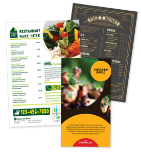
Decide on the size of the menu you want to print. Many restaurant owners make this decision based on common sizes such as 8.5 x 11 or 8.5 x 14. Your menu does not need to look like the others, unless you decide to place your menu inside clear cafe menu covers (which are limited in sizes). The question you need to ask yourself is “why limit myself”, especially since you are making the menu for your dining room and the number of table or the seating available. The cost of customizing your menu to your liking and making it a unique size is very minimal with regard to the printing cost. Many restaurant managers think that the cost of printing a unique size menu may be too high; however, they often realize that the cost of printing 50 to 100 menus (which is determined by the number of tables in the dining room) is minimal compared to the cost to print them in a unique size. Do not limit yourself. You are spending less on printing your menu and far more on your time to design the menu, whether you’re making a NEW menu or making CHANGES to your current menu.
 Color and Background
Just as picking the right font is essential to any menu, choosing the right color is just as important. You and you alone know the lighting in your restaurant and that should be the basis for your Font color or Menu Background color. You do not want a dark colored background or a light font if your dining room is not well lit or has a dinner atmosphere. Having a nice graphic or an abstract art background may be a nice touch, but it will be too hard to read and become distracting for your customers. You want your customers to be at ease, feeling good and having an experience worth repeating.
Do You Really Need Images?
 If you have been dining out you will notice that there are few types of menus.
The first type is that big image, casual, café style menu in such restaurants as Applebee’s, Chili’s and Denny’s that feature large size images with some pages having no descriptions whatsoever.
Another type is that small independent restaurant style that often uses the 8.5 x 11 menu size with many images with much description. You also tend to see more items on these menus.
The other type is the high-end diner or steakhouse restaurant. Those tend to have one color, a basic font and leave out the descriptions altogether. You often find those in high priced restaurants. I believe that it is intentional because they want you to interact with the server, making the customer the most important person at that moment.
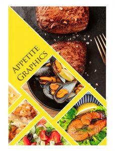
Many restaurants struggle with choosing the right photo or image. There is no substitute for having professional photos taken of your food but some restaurants have limited time and resources. Choosing a stock photo may be a good option. Do not limit yourself by using a photo that has a different bun or cheese or lettuce. You can use vegetables and ingredients to make your food look fresh.
Whether your restaurant is for breakfast, lunch or dinner, choosing the right font, color, size and image is essential.

I look forward for your feedback.
Write back to hani@mrgrphx.com
Hani Jouni
Appetite Graphics by Ad America
