by Ad America | Oct 5, 2026 | Awards and Trophies
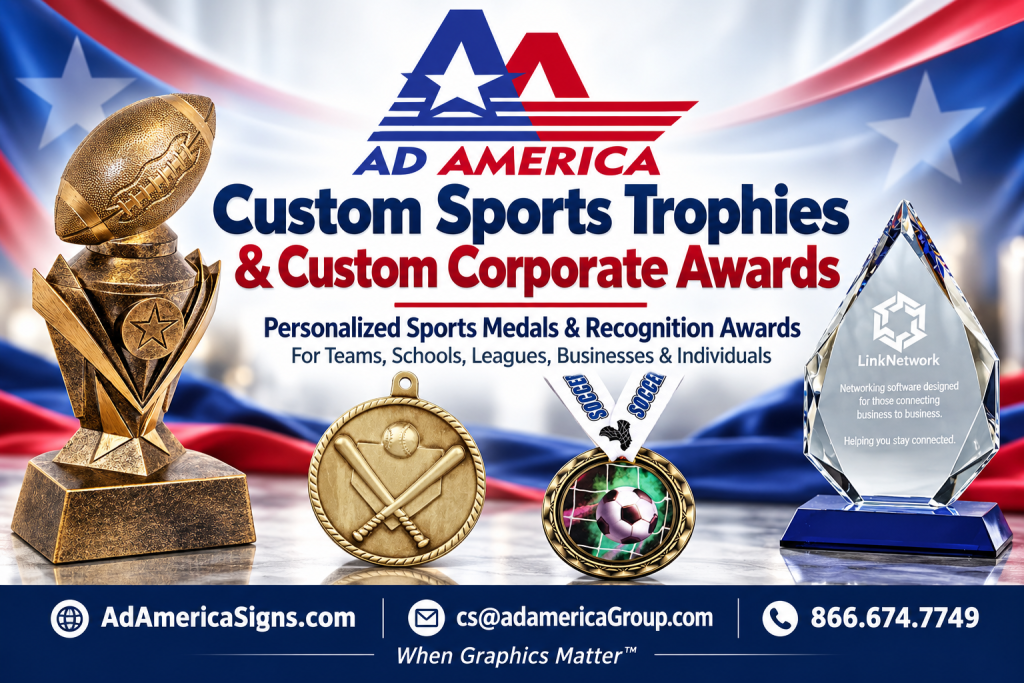 Recognizing Achievement Across Southern California
When the final whistle blows or the fiscal year wraps up, nothing marks an achievement like an award made specifically for the moment. That’s why leagues, athletic directors, individual coaches, and Southern California businesses come to Ad America for Custom Sports Trophies, sports medals, and Custom Corporate Awards that reflect the effort behind every win. Serving Southern California Since 1986, Ad America has spent decades helping local organizations recognize achievement in a way that feels personal, professional, and built to last.
Whether you’re an athletic director closing out a championship season, a tournament organizer handing out dozens of awards in a single weekend, or a business owner recognizing a top-performing team, the right trophy or award does more than sit on a shelf — it tells a story. This guide covers who relies on Custom Sports Trophies and Custom Corporate Awards, why they matter, and how Ad America makes ordering simple for organizations across the region.
Who Needs Custom Sports Trophies and Custom Corporate Awards
Across the Inland Empire, Los Angeles County, Orange County, and the rest of Southern California, a wide range of organizations and individuals rely on Ad America for recognition pieces that match the moment. Our clients include:
- Schools and school districts ordering trophies, medals, and plaques for athletics, academics, and end-of-year ceremonies.
- Youth sports leagues that need Custom Sports Trophies and medals for an entire season of divisions and age groups.
- Club and travel teams competing in regional and national tournaments who want awards that reflect their program’s identity.
- Tournament and race organizers handling bulk orders of medals and trophies on tight event timelines.
- City recreation departments recognizing participants across baseball, soccer, basketball, and community programs.
- Businesses and corporations presenting Custom Corporate Awards for employee milestones, sales achievements, and client appreciation.
- Chambers of commerce and business associations honoring members at annual dinners and community events.
- Nonprofits and service clubs recognizing volunteers, donors, and community leaders.
- Dance, cheer, gymnastics, and martial arts programs celebrating competition placements and belt or rank advancements.
- Individuals — coaches, parents, and team managers — placing smaller orders for a single team or special occasion.
Whatever the group size or budget, Ad America works directly with athletic directors, league commissioners, event coordinators, and business owners to make sure every award fits the occasion.
Why Custom Sports Trophies and Sports Medals Matter
A trophy is more than a piece of hardware handed out at the end of a season — it’s a lasting record of effort, teamwork, and improvement. For athletic directors and league commissioners, Custom Sports Trophies and sports medals give every participant, not just the top finishers, something tangible to show for a season of practices, games, and travel.
Custom Sports Trophies also help leagues and tournament organizers stand apart. A generic award ordered off a shelf looks the same as every other team’s; a trophy engraved with your league’s name, logo, and season details becomes part of your organization’s identity. That consistency matters for travel teams and club programs that compete across multiple tournaments throughout the year and want their recognition pieces to look as professional as their uniforms.
Sports medals work the same way for races, tournaments, and large-participation events. Race organizers and city recreation departments often need hundreds or even thousands of medals produced on a strict timeline, in a range of finishes — gold, silver, bronze, or a single custom design for every finisher. Dance, cheer, gymnastics, and martial arts programs rely on the same flexibility, ordering medals and trophies for competition placements, rank advancements, and end-of-year recitals.
For individuals — a coach recognizing a single standout player, or a parent organizing a team banquet — Ad America makes it just as easy to order a small batch of Custom Sports Trophies as it is for a league to order hundreds. Every order, large or small, gets the same attention to detail and craftsmanship.
Custom Corporate Awards for Southern California Businesses
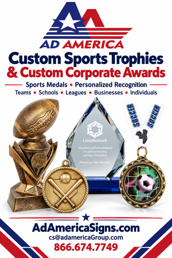 Recognition matters off the field, too. Businesses throughout the Inland Empire and greater Southern California turn to Ad America for Custom Corporate Awards that mark employee anniversaries, sales milestones, safety records, and retirements. A well-made plaque or award communicates that a company notices and values the people behind its success — and a Custom Corporate Awards program built around consistent branding reinforces company culture every time one is presented.
Chambers of commerce and business associations are some of our most frequent corporate clients. Annual dinners, “business of the year” honors, ribbon-cutting keepsakes, and member-appreciation gifts all call for awards that look polished and feel substantial. Ad America works with chamber staff to design pieces that can be reordered year after year, so a signature award program becomes part of the organization’s identity.
Nonprofits and service clubs have similar needs on a different budget. Volunteer recognition dinners, donor appreciation events, and board member gifts all benefit from Custom Corporate Awards that feel meaningful without straining a limited budget. Ad America offers a range of materials and price points, from affordable acrylic awards to premium crystal and wood pieces, so nonprofits can recognize generosity at any scale.
Whatever the occasion, Custom Corporate Awards from Ad America are designed, produced, and finished locally — which means faster turnaround and a point of contact who understands Southern California business culture, not a call center on the other side of the country.
Why Choose Ad America for Custom Sports Trophies and Custom Corporate Awards
Ad America has been Serving Southern California Since 1986, which means four decades of relationships with schools, leagues, cities, and businesses across the region. That history matters when you’re ordering Custom Sports Trophies for a 300-team youth league or Custom Corporate Awards for a company-wide ceremony — Ad America has the production capacity and local know-how to handle orders of any size, on deadline.
Ad America proudly serves businesses, schools, leagues, and organizations throughout:
- Upland
- Ontario
- Rancho Cucamonga
- Pomona
- Claremont
- Fontana
- Riverside
- San Bernardino
- Los Angeles County
- Orange County
- Riverside County
- San Bernardino County
- Throughout Southern California
Because Ad America is local, athletic directors and event coordinators can speak directly with the people designing and producing their awards — not a national call center. That local relationship means faster proofs, easier last-minute changes, and a partner who understands the tournaments, leagues, and business communities of the Inland Empire and beyond.
How to Order Custom Sports Trophies and Custom Corporate Awards
Ordering is straightforward, whether you’re an athletic director placing a season-end bulk order or a business owner recognizing a single employee. Start by browsing available styles, materials, and sizes in our full product catalog, where you can see options for trophies, medals, plaques, and corporate awards side by side.
From there, Ad America’s team helps with:
- Selecting the right award style, material, and size for your budget and timeline.
- Adding your league, school, team, or company logo and custom text.
- Approving a digital proof before anything goes into production.
- Coordinating delivery or pickup in time for your banquet, ceremony, or tournament.
For a closer look at our broader sign, award, and recognition products, visit AdAmericaSigns.com to see examples of past work and additional product lines. Large orders for leagues, school districts, and city recreation departments can be scheduled well in advance, so if you’re planning a season or an annual event, reach out early to lock in your production slot.
Get Started with Ad America
From a single trophy for a Little League team to a season’s worth of Custom Sports Trophies for a district-wide athletic program, or a boardroom’s worth of Custom Corporate Awards, Ad America brings the same craftsmanship and local service that Southern California organizations have relied on since 1986. Leagues, athletic directors, individuals, and businesses across Upland, Ontario, Rancho Cucamonga, Riverside, San Bernardino, and the rest of Southern California trust Ad America to get recognition right — on time, on budget, and on brand.
Ready to order Custom Sports Trophies or Custom Corporate Awards for your next season, tournament, or company event? Contact Ad America today to start your design and get a quote.
by Ad America | Sep 18, 2026 | Fleet Graphics, Graphic Design
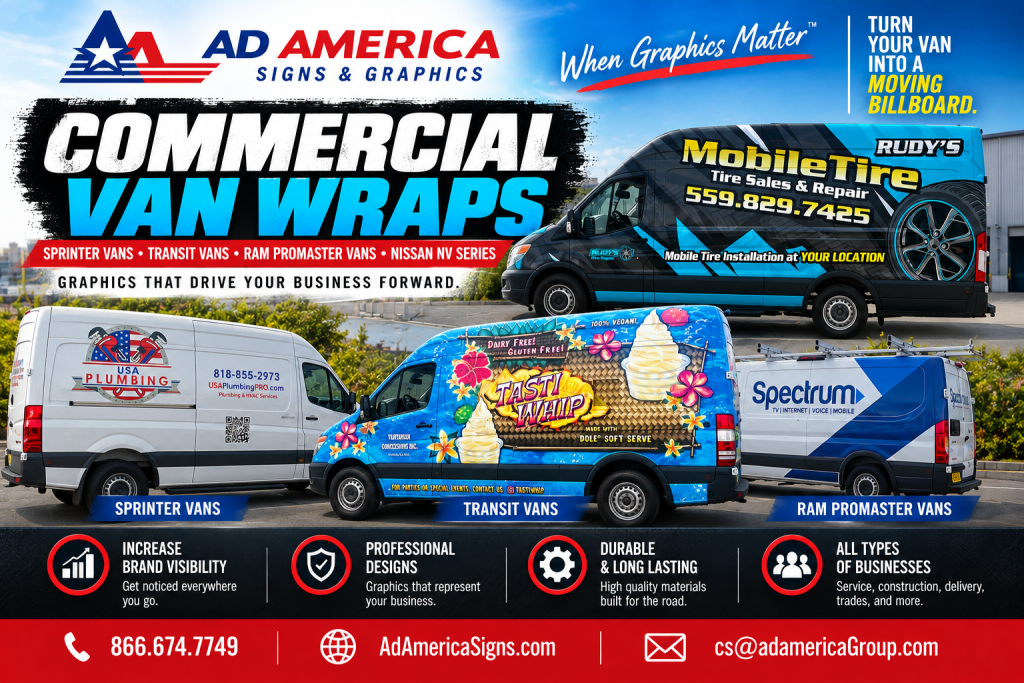 If your business runs on a Mercedes-Benz Sprinter, Ford Transit, Ram ProMaster, or Nissan NV van, you already own one of the most effective advertising tools available to you — you just might not be using it yet. Commercial van wraps turn an ordinary work van into a moving billboard that advertises your business every time it’s parked outside a job site, sitting in traffic, or pulling into a customer’s driveway.
Ad America has been Serving Southern California Since 1986, designing and installing custom vehicle graphics for van owners across every trade and industry. Whether you run a single cargo van or a growing fleet of service vehicles, our team builds commercial van wraps that make your business impossible to miss on the road.
Why Commercial Van Wraps Are a Smart Investment for Van Owners
Work vans spend more time visible to the public than almost any other business asset you own. They sit outside client homes for hours during a service call, park in shopping center lots between jobs, and drive through dozens of neighborhoods every single day. That visibility is essentially free advertising — but only if the van is actually branded to take advantage of it.
Traditional advertising comes with recurring costs and a short shelf life: a radio spot ends, a print ad gets recycled, a digital banner expires. A van wrap is a one-time investment that keeps working for years, generating thousands of impressions per day at a fraction of the cost-per-impression of almost any other marketing channel. It also builds instant credibility — a professionally wrapped van signals an established business rather than someone working out of an unmarked vehicle, which matters when a potential customer is deciding who to call. For van owners in competitive trades like HVAC, plumbing, electrical, landscaping, cleaning, and delivery services, commercial van wraps are often one of the highest-return investments a small business can make.
Which Vans Can Be Wrapped? Sprinter, Transit, ProMaster, and Nissan NV Explained
Not all cargo vans are built the same, and each body style offers its own opportunities when it comes to applying graphics.
Sprinter Van Wraps
The Mercedes-Benz Sprinter is one of the most popular commercial vans on the road, prized for its cargo space, tall roofline, and long, flat side panels. Those uninterrupted panels make it one of the easiest vans to wrap cleanly, giving designers a large canvas for wraparound graphics that flow smoothly from the rear doors across the sides, with logo placement sized to be legible both up close and from a distance in highway traffic.
Ford Transit Van Wraps
The Ford Transit is a workhorse for delivery companies, contractors, and service businesses throughout Southern California. Its boxy, upright shape offers generous surface area for branding, though its multiple roof heights and wheelbase options mean a wrap installer has to account for more curves and seams than a Sprinter. Because many Transit owners run multiple vans, we place special emphasis on fleet consistency, making sure every van matches in color, logo placement, and messaging regardless of when it joined the fleet.
Ram ProMaster Van Wraps
The Ram ProMaster’s wide, flat-front design and boxy cargo area make it one of the best-suited vans for large, high-impact wraps. Its front-wheel-drive platform gives it a lower step-in height and a slightly different wheel well shape, which our designers account for so logos and graphics line up perfectly around every curve, mirror, and door handle. The ProMaster’s broad panels are ideal for full wraps that tell a complete visual story about your business rather than just a logo and phone number.
Nissan NV Series Van Wraps
The Nissan NV Cargo and NV Passenger vans remain a common choice for service businesses that want a durable, no-frills work vehicle. Their more traditional body shape includes pronounced lines running along the sides, which simply require more precise measuring and material handling to avoid bubbling or lifting. We design wraps for the NV200, NV1500, NV2500, and NV3500 with the same attention to fit and durability as our larger van wraps.
No matter which of these vans you drive, the underlying principle is the same: a professionally designed and installed wrap turns your vehicle into a consistent, branded asset across your entire fleet.
What Areas of Your Van Need Graphics Applied
When business owners picture a van wrap, they usually think of the two side panels — but an effective wrap strategy covers more of the vehicle than that. The rear doors are prime real estate, since they’re what the driver behind you stares at during every red light. The hood and front bumper create a strong first impression as you pull into a customer’s driveway, and many businesses also wrap the roof, which matters more than people expect once you consider how often a van is viewed from an overpass or a parking structure.
Not every van owner needs, or has the budget for, a full wrap right away, and graphics come in several levels depending on your goals. A full wrap covers the entire van in custom-printed vinyl for maximum visibility and the most polished look. A partial wrap covers select panels — often the rear doors, hood, or lower half — combining printed graphics with the factory paint for a striking look at a lower cost. Van lettering and decals are the most budget-friendly option, applying your logo, company name, phone number, and website directly to the van’s existing paint. Many of our clients start with lettering or a partial wrap and upgrade to a full wrap as the business grows, and because we design with that upgrade path in mind, the transition is seamless.
The Commercial Van Wrap Process at Ad America
Getting a van wrapped isn’t as simple as slapping a sticker on the door. The process starts with a design consultation, where our team learns about your brand, your target customers, and the message you want your van to communicate. From there, our designers build a custom template mapped to the exact make and model of your vehicle — a Sprinter template isn’t interchangeable with a Transit or ProMaster template, since panel dimensions and curves differ significantly between vans.
Once the design is approved, we print on premium cast vinyl with UV-resistant laminate built to withstand the Southern California sun, hold its color through regular washing, and stand up to the door dings and curb scrapes that come with daily service calls. Installation is handled by trained technicians in a controlled environment, ensuring the vinyl is properly stretched, heated, and sealed around mirrors, handles, and body lines without bubbling. With proper care, a professionally installed wrap typically lasts five to seven years — often outlasting the van’s original factory paint job in appearance.
Good design also has to do the job of actually converting a passing glance into a phone call. Our wraps prioritize large, legible contact information, since most people only get a few seconds to read a van as it passes; a clear, simple description of what your business does; and brand colors and logo placement that stay consistent with your other marketing, from business cards to your website.
You can see examples of our custom vehicle graphics on our products page, where we showcase van, truck, and trailer wraps produced for businesses throughout the region. For more on our full vehicle wrap and signage capabilities, visit Ad America Signs.
Frequently Asked Questions About Commercial Van Wraps
How much do commercial van wraps cost? Pricing depends on the van size, coverage (full wrap, partial wrap, or lettering), and design complexity. Ad America provides free quotes so van owners can compare options before committing to a package.
How long does it take to wrap a van? Most Sprinter, Transit, ProMaster, and NV van wraps are installed within one to three days, depending on the scope of the design and whether it’s a full or partial wrap.
Will a wrap damage my van’s paint? No. When installed and removed correctly, a professional vinyl wrap actually protects the factory paint underneath from UV exposure and minor scratches during the time it’s applied.
Can you wrap a whole fleet of mixed van models? Yes. We regularly design and install wraps across mixed fleets that include Sprinter, Transit, ProMaster, and Nissan NV vans together, keeping branding consistent across every vehicle regardless of make or model.
Why Choose Ad America for Commercial Van Wraps
Ad America has been Serving Southern California Since 1986, which means we’ve spent decades learning how to design and install graphics that hold up on the region’s vans, fleets, and daily-driven work trucks. We’ve wrapped Sprinter vans for HVAC companies, Transit vans for delivery fleets, ProMaster vans for plumbing and electrical contractors, and Nissan NV vans for everything from mobile detailing businesses to landscaping crews. That experience is the difference between a wrap that looks good on day one and one that still looks sharp three years later — backed by in-house designers, premium materials rated for years of road use, and a streamlined process from design proof to installation.
Proudly Serving Van Owners Throughout Southern California
Ad America proudly serves businesses throughout:
- Upland
- Ontario
- Rancho Cucamonga
- Pomona
- Claremont
- Fontana
- Riverside
- San Bernardino
- Los Angeles County
- Orange County
- Riverside County
- San Bernardino County
- Throughout Southern California
Wherever your vans are based, our team can design, produce, and install commercial van wraps for Sprinter, Transit, Ram ProMaster, and Nissan NV vehicles that keep your business visible and professional on every route.
Get Started on Your Commercial Van Wraps Project
Your van is already on the road every day — make sure it’s working as hard for your business as you are. From a single lettering package to a full fleet of wrapped Sprinter, Transit, ProMaster, and Nissan NV vans, Ad America brings decades of Southern California experience to every project we take on.
Contact Ad America today to schedule a free design consultation for your commercial van wraps, 866.674.7749.
by Ad America | Sep 10, 2026 | Fleet Graphics
Every construction company depends on two things to win new work: a reputation for quality, and visibility in the communities where that work happens. That’s exactly where Construction Trucks and Signage come in. From pickup trucks and dump trucks branded with bold wraps to the job site signs posted at every active project, the right graphics turn your everyday operations into a constant source of brand recognition, lead generation, and professionalism.
Since 1986, Ad America has been Serving Southern California with custom vehicle graphics and signage for contractors, builders, developers, and trade companies of every size. Whether you need a full wrap for your fleet of construction trucks or a durable job site sign that can withstand months of dust, weather, and heavy equipment traffic, our team designs and produces Construction Trucks and Signage that work as hard as your crews do.
Why Construction Trucks and Signage Matter for Contractors
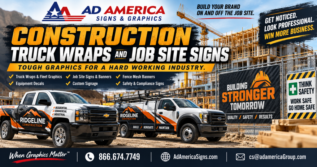 Construction companies are unique in that their vehicles and signage do double duty. Trucks aren’t just transportation — they’re parked in driveways, at supply yards, and along residential streets for hours at a time, giving neighbors, homeowners, and passersby a long look at your branding. Job sites, meanwhile, are often the single most visible marketing asset a contractor has in a given neighborhood, sometimes for weeks or months at a stretch.
Investing in professional Construction Trucks and Signage delivers value in a few specific ways. It builds instant credibility, since homeowners and commercial clients are far more likely to trust a company that looks established and organized. It generates passive leads, because every truck parked at a job site or driving through a neighborhood is a potential referral source for the next project on that same street. And it reinforces your brand across every touchpoint, from the truck in the driveway to the sign on the fence to the invoice in the client’s inbox.
At Ad America, we treat Construction Trucks and Signage as a coordinated system rather than a collection of one-off purchases, so your brand looks consistent everywhere it appears.
Construction Truck Wraps: Turning Your Fleet Into a Marketing Asset
Construction fleets include everything from pickup trucks and service vans to dump trucks, flatbeds, and heavy equipment trailers. Each of these vehicles offers valuable advertising space, and truck wraps are one of the most effective ways to make use of it.
Our construction truck wrap services include:
Full wraps that cover the entire vehicle in custom-printed graphics for maximum visibility. Partial wraps that combine printed graphics with the vehicle’s existing paint for a cost-effective branding option. Door and tailgate lettering with your company name, phone number, website, and license number. Reflective and high-visibility elements that improve safety around active job sites and roadways. Durable, weather-resistant vinyl designed to handle the dust, gravel, and rough conditions that come with construction work.
Because construction vehicles often see harder use than a typical company car — think gravel roads, job site debris, and frequent washing — we select vinyl films and laminates specifically suited to that wear. That durability is a core part of what makes Construction Trucks and Signage from Ad America a smart long-term investment rather than a graphic that needs replacing every year.
Job Site Signs That Build Trust and Generate Leads
While truck wraps handle mobile branding, job site signs are the anchor of your on-location presence. A well-designed job site sign tells everyone walking or driving by exactly who is doing the work, what the project is, and how to reach you — turning a construction zone into a marketing opportunity instead of just a disruption.
Ad America produces a full range of job site signage, including:
Project identification signs featuring your logo, company name, and contact information, ideal for posting at the entrance to a job site. Permit and safety signs required by local building departments or OSHA regulations. Directional and site-safety signage to guide subcontractors, deliveries, and visitors around an active work zone. Coming soon and now hiring signs that keep the community engaged and generate future business or staffing leads. Fence banners and mesh signs sized for chain-link construction fencing, built to withstand wind and weather for the duration of a project.
Because job site signs often stay in place for weeks or months, material choice matters just as much as design. We use corrugated plastic, aluminum, and heavy-duty banner materials rated for extended outdoor exposure, so your Construction Trucks and Signage keep representing your brand professionally from groundbreaking to final walkthrough.
Designing Construction Trucks and Signage for Maximum Visibility
Good design matters just as much as durable materials. Because construction trucks and job site signs are usually viewed from a distance — across a street, from a passing car, or from the sidewalk — our design team focuses on a few key principles for every project:
High-contrast color schemes that remain legible in bright Southern California sunlight. Large, clean typography that can be read quickly by someone driving past at 35 or 45 miles per hour. Consistent logo placement and brand colors across every truck, sign, and banner so your company is instantly recognizable. Clear contact information, including phone number and website, since job site signs are often the first — and sometimes only — chance to capture a lead.
This attention to detail is what separates Construction Trucks and Signage that actually generate business from graphics that simply look nice but get overlooked.
Materials Built for Job Site Conditions
Construction environments are demanding, and signage that isn’t built for the job won’t last. Ad America selects materials specifically for the environment each piece of Construction Trucks and Signage will face.
For vehicle wraps, we use commercial-grade cast vinyl with UV-resistant laminates that resist fading from constant sun exposure and hold up against dust, gravel chips, and frequent pressure washing. For job site signs, we typically recommend rigid aluminum or corrugated plastic for short- to mid-term postings, and heavy-duty vinyl mesh banners for fence-mounted signage that needs to let wind pass through rather than catching it like a solid panel. For longer projects, we can also produce more permanent monument-style or post-mounted signs that hold up for the full duration of multi-phase developments.
Choosing the right material up front saves money over the life of a project, since a sign or wrap that fades, cracks, or tears halfway through construction ends up costing more to replace than it would have to build correctly the first time.
Permits, Ordinances, and Planning Ahead for Job Site Signage
One thing many contractors overlook is that job site signage isn’t always a simple matter of ordering a banner and zip-tying it to a fence. Many cities and counties throughout Southern California have specific ordinances governing sign size, placement, illumination, and duration — especially for signs facing public streets or located near residential neighborhoods. Some jurisdictions require a temporary sign permit for anything beyond a small project identification sign, while others regulate banner size on construction fencing to prevent visual clutter along major corridors.
Ad America helps contractors navigate these requirements before signage goes up, not after a code enforcement notice arrives. We can advise on standard sizing that tends to fall within common municipal guidelines, recommend mounting methods that satisfy wind-load and safety requirements, and help you plan signage timelines around permit approval so your Construction Trucks and Signage are ready the moment the project needs them. Planning ahead on the signage side means one less delay standing between your crew and groundbreaking.
Frequently Asked Questions About Construction Trucks and Signage
How long do construction truck wraps last? With quality materials and proper installation, a full or partial truck wrap typically lasts five to seven years, even with the rougher daily use construction vehicles see on job sites and gravel roads.
Do job site signs need a permit? It depends on the city or county. Many jurisdictions throughout the Inland Empire, Los Angeles County, and Orange County allow small project identification signs without a permit, but larger banners, illuminated signs, or signs near public rights-of-way often require one. Ad America can help you determine what applies to your specific project location.
Can you brand an entire fleet at once, including trucks, trailers, and equipment? Yes. We regularly handle fleet-wide rollouts that include pickup trucks, dump trucks, trailers, and job site signage together, so every piece of Construction Trucks and Signage matches across your entire operation.
What’s the most durable material for a fence-mounted job site banner? Heavy-duty vinyl mesh is generally the best choice for fence-mounted signage, since its perforated design lets wind pass through instead of putting stress on the grommets and fence ties — extending the life of the banner through an entire project timeline.
Why Choose Ad America for Construction Trucks and Signage
Ad America has been Serving Southern California Since 1986, and contractors throughout the region trust us because we understand both the marketing side and the practical, on-the-ground realities of construction work. When you choose Ad America for Construction Trucks and Signage, you get:
Decades of experience producing durable, professional signage and vehicle graphics for the construction industry. In-house design teams who understand how to make your brand stand out on a truck, a fence, or a job site entrance. Premium materials selected specifically for outdoor, high-wear environments. A streamlined process from design proof to installation, so your trucks and signs are ready before your next project breaks ground.
You can browse more of our vehicle graphics, decals, and signage options on our products page, where we showcase the full range of wraps, banners, and signs we produce for contractors across the region. For more on our full commercial signage and vehicle graphics capabilities, visit Ad America Signs.
Proudly Serving Contractors Throughout Southern California
Ad America proudly serves businesses throughout Upland, Ontario, Rancho Cucamonga, Pomona, Claremont, Fontana, Riverside, San Bernardino, Los Angeles County, Orange County, Riverside County, San Bernardino County, and throughout Southern California. Wherever your job sites are located, our team can design, produce, and install Construction Trucks and Signage that keeps your brand visible and your crews looking professional from the first day on site to the last.
Get Started on Your Construction Trucks and Signage Project
Your trucks and job sites are already visible to hundreds of potential customers every week — make sure that visibility is working in your favor. From full fleet wraps to durable job site signs, Ad America brings decades of Southern California experience to every Construction Trucks and Signage project we take on.
Contact Ad America today to get a free quote on construction truck wraps, job site signs, and every other piece of signage your projects need.
by Ad America | Sep 9, 2026 | Graphic Design
When most people think about graphic design, they picture a logo or a website. But some of the most important design work a business ever commissions is small enough to fit in a wallet: the business card. At Ad America, this craft has been at the center of what we do since 1986, and business card design is where we see it make an outsized impact for local companies every single day.
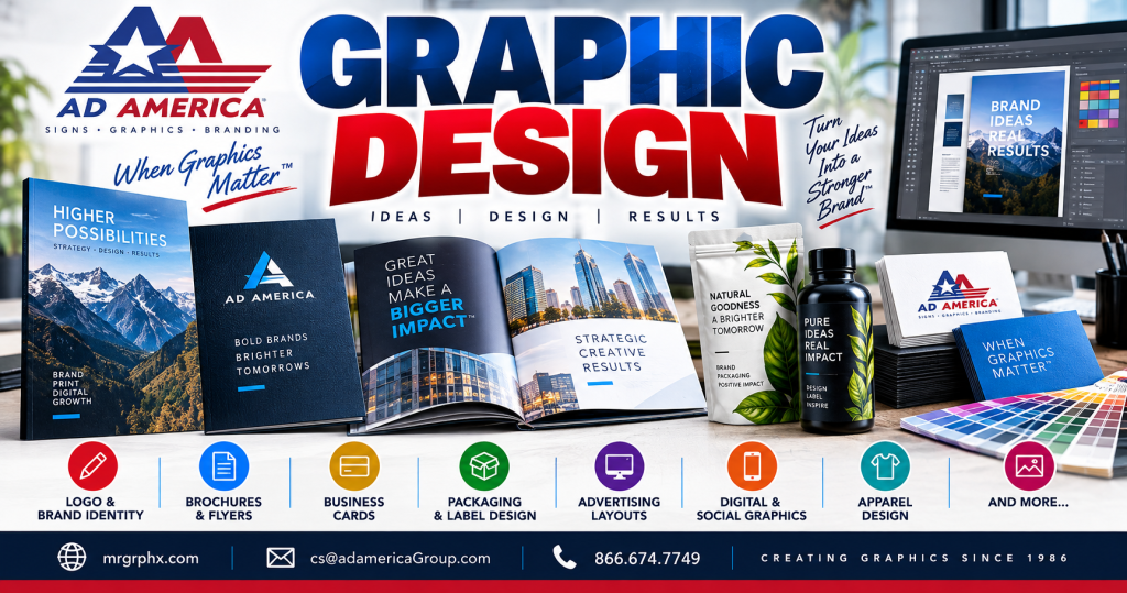 Serving Southern California Since 1986, Ad America has spent four decades helping businesses look as professional as they perform. Whether you’re a contractor handing a card to a new client, a real estate agent networking at an open house, or a startup founder meeting investors for the first time, the design on that small card is often the first tangible thing a prospect holds onto after meeting you. Get it wrong, and it’s forgettable at best. Get it right, and it becomes a quiet, constant advertisement for your brand.
Why Graphic Design Still Starts With the Business Card
In a world of digital contacts, QR codes, and LinkedIn connections, it would be easy to assume the printed business card is obsolete. It isn’t. Studies on first impressions consistently show that a well-designed, tactile business card signals credibility in a way a phone screen simply cannot. Good graphic design on a business card communicates professionalism, attention to detail, and brand consistency before a single word is spoken.
That’s why our team treats business card design with the same rigor we apply to full brand identity projects. Every element — typography, color palette, paper stock, finish, and layout — is a graphic design decision that either reinforces your brand or quietly undermines it. We ask the same questions large agencies ask for major rebrands: What should someone feel when they hold this card? Does the design match the tone of the business? Is the information easy to scan in three seconds or less?
Business Card Design: The Details That Make the Difference
Business card design sits at the intersection of graphic design and commercial printing, and both halves matter equally. A brilliant design printed on flimsy stock feels cheap. A beautifully printed card with cluttered, inconsistent design feels unprofessional. Ad America handles both sides in-house, which means the work our team creates is built from the start with the realities of commercial printing in mind — bleed lines, color profiles, paper weight, and finish are all considered during the design phase, not as an afterthought.
Here’s what goes into professional business card design at Ad America:
- Typography that reflects your industry. A law firm’s card should not look like a nightclub flyer. Our design team selects fonts that match your brand voice and remain legible at small sizes.
- Color that matches your full brand system. Your business card should look like it belongs to the same family as your logo, website, and signage — not like it was designed by a different company.
- Layout that respects hierarchy. Name, title, company, and contact information need a clear visual order so the eye knows where to go first.
- Finish and stock selection. Matte, gloss, soft-touch, spot UV, or raised ink — these commercial printing choices are part of the design conversation, not separate from it.
- Consistency across formats. The same visual language should carry through to your brochures, signage, and digital assets.
Because business card design often serves as someone’s introduction to your full visual identity, we treat it as a strategic project, not a quick add-on. If you’d like a deeper look at how graphic design connects signage, web design, and print together as one cohesive system, our team has written more about that approach here: Graphic Design, Signs, Web Design & Print. It’s a useful read if you’re trying to understand how all your marketing materials should work together rather than as disconnected pieces.
Logo Design: The Foundation Every Business Card Builds On
You can’t design a great business card without a strong logo behind it. Logo design is foundational graphic design work — it’s the single visual mark that has to work at every size, from a favicon to a building sign, and it has to hold up in black and white as well as full color. At Ad America, logo design is where most design projects begin, because everything else, including business card design, brochures, and commercial printing materials, inherits its DNA from the logo.
A well-executed logo does more than look good. It should be simple enough to reproduce accurately across commercial printing processes, distinctive enough to be recognized instantly, and flexible enough to scale from a business card down in the corner to a 20-foot storefront sign. When our graphic design team develops a logo, we’re already thinking ahead to how it will appear on your business cards, brochures, vehicle wraps, and signage — because a logo that only works on a website isn’t finished.
Brochure Design: Telling the Fuller Story
While a business card makes the first impression, brochure design gives you room to make the case. Brochures remain one of the most effective graphic design tools for businesses that need to explain services, showcase a portfolio, or leave something substantial behind after a meeting or trade show.
Effective brochure design requires the same design discipline as business card design, just at a larger scale. Folds, panels, and page order all need to guide the reader logically from a headline through supporting detail to a clear call to action. Our graphic design team builds brochures that are as strategic as they are attractive — every panel earns its place, and the commercial printing specifications (paper stock, fold type, coating) are chosen to match how and where the brochure will actually be used, whether that’s a trade show table, a real estate open house, or a leave-behind after a sales call.
Because brochures often need to be updated as offerings change, we also design with future revisions in mind, keeping source files organized so updates don’t mean starting the design from scratch every time.
Commercial Printing: Where Graphic Design Becomes Real
Great graphic design only matters if it prints the way it was intended to look. That’s why Ad America keeps commercial printing and design under one roof. When the same team handles both the design and the print production, there’s no gap between what was designed on screen and what comes off the press — colors match, alignment is precise, and finishing touches like foil stamping, embossing, or spot UV coating are planned for from the first design draft.
Our commercial printing capabilities support everything discussed above: business cards, logos translated into physical signage and stationery, brochures in every fold style, and much more, including postcards, flyers, banners, and large-format print. Because we’ve been refining this process since 1986, we understand the technical realities of commercial printing that many design-only studios overlook — things like ink coverage, paper grain direction, and how a design that looks perfect on a monitor needs slight adjustments to look perfect on paper.
If you want to see examples of commercial printing work alongside creative design projects from a company with decades of experience, AdAmericaSigns.com showcases additional signage and print work our team has produced for Southern California businesses.
Creating High-Quality Graphics Since 1986
Ad America has been creating high-quality graphics since 1986, and that history matters when you’re trusting a company with your brand’s visual identity. Design trends come and go, but the fundamentals of what makes a business card, logo, brochure, or printed piece effective have remained consistent: clarity, quality materials, and design that reflects the business behind it.
Four decades in the design and commercial printing industry means we’ve seen technology shift from paste-up boards to fully digital workflows, and we’ve adapted our process every step of the way without losing sight of the craftsmanship that makes printed materials feel premium. When a business chooses Ad America for graphic design, business card design, logo design, brochure design, or commercial printing, they’re working with a team that has already solved most of the problems that can go wrong in production — because we’ve been solving them since 1986.
Serving Southern California Since 1986
Ad America proudly serves businesses throughout Southern California with graphic design, business card design, logo design, brochure design, and commercial printing services, including:
- Upland
- Ontario
- Rancho Cucamonga
- Pomona
- Claremont
- Fontana
- Riverside
- San Bernardino
- Los Angeles County
- Orange County
- Riverside County
- San Bernardino County
- Throughout Southern California
Whether you’re a small business in Claremont ordering your first set of business cards or an established company in Los Angeles County refreshing your entire brand identity, our design and commercial printing team is equipped to handle projects of every size across the region.
Why Local Businesses Choose Ad America for Graphic Design
Choosing a local graphic design partner has real advantages over working with a faceless online print shop. When you work with Ad America, you get a team that understands the Southern California business landscape, can meet with you in person to discuss your business card design or brochure project, and stands behind the commercial printing quality of everything we produce.
A few reasons businesses across Upland, Ontario, Rancho Cucamonga, and beyond keep coming back to us for design work:
- Decades of experience. We’ve been perfecting graphic design and commercial printing since 1986.
- One team, start to finish. Design and print production happen under the same roof, so nothing gets lost in translation.
- Full-service capability. From business card design to logo design, brochure design, signage, and large-format commercial printing, we cover the full spectrum of design needs.
- Local accountability. As a Southern California company, we’re accessible to the communities we serve, not a call center on the other side of the country.
Ready to Elevate Your Brand With Professional Graphic Design?
Your business card is often the smallest investment you’ll make in your brand — and one of the most frequently seen. Paired with a strong logo, a well-designed brochure, and quality commercial printing, professional graphic design gives every piece of your business a consistent, credible presence in front of the people who matter most: your customers.
Ad America has been creating high-quality graphics since 1986, and we’re ready to bring that experience to your next project, whether it’s a simple business card redesign or a full suite of brochures, signage, and printed materials. To learn more about how these pieces work together as one strategy, take a look at our related resource on Graphic Design, Signs, Web Design & Print, or explore more of our commercial printing portfolio at AdAmericaSigns.com.
Contact Ad America today to start your business card design, logo design, brochure design, or commercial printing project with a team that has served Southern California since 1986.
by Ad America | Sep 8, 2026 | Food Trucks & Concessions
Every school campus communicates constantly, even when no one is speaking. A monument sign at the entrance tells visitors where they are. A row of PBIS posters in the hallway reminds students how to act. A banner outside the gym announces a championship season. Individually, these are just School Signs. Together, they form the backbone of a school’s School Campus Graphics program — the complete visual system that shapes how students, staff, and visitors experience a campus every single day.
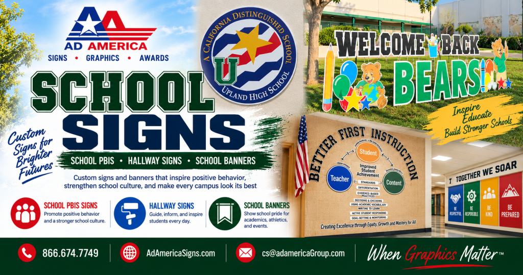 At Educated Graphics by Ad America, Serving Southern California Since 1986, we design and install School Signs for districts, private schools, and universities across the region, and we plan every project as part of a bigger School Campus Graphics strategy rather than a one-off request. This article looks at why School Signs matter so much, how School PBIS signage supports behavior and culture, and how hallway signs and banners round out a campus that looks and feels unified from the front entrance to the last classroom door.
Why School Signs Are Central to School Campus Graphics
School Signs are often the very first piece of communication a family or visitor encounters, long before they meet a teacher or step into a classroom. A well-designed entrance or monument sign sets expectations immediately, while directional and wayfinding signs help people move through campus with confidence instead of confusion.
Because School Signs appear in so many forms — exterior signage, interior directional signs, PBIS displays, hallway graphics, and event banners — they need to be planned as one connected system rather than a series of disconnected purchases. That is exactly what a School Campus Graphics program is designed to do. When every sign on campus uses the same colors, fonts, and logo treatment, the entire property feels cohesive, professional, and intentional, which reflects well on the school and the district as a whole.
School PBIS Signs: Reinforcing Positive Behavior Campus-Wide
Positive Behavioral Interventions and Supports, better known as PBIS, has become one of the most widely adopted behavior frameworks in schools across the country, and School PBIS signage is one of the most effective tools for reinforcing it visually. Instead of relying only on verbal reminders, schools use PBIS signs posted throughout hallways, cafeterias, gymnasiums, and classrooms to keep expectations visible at all times.
Common School PBIS signage includes behavior matrix posters that outline expectations for respect, responsibility, and safety in each area of the building, hallway banners celebrating classes or grade levels that model positive behavior, recognition displays for students who exemplify PBIS values, and color-coded signage that ties into a school’s existing PBIS tier system. Because PBIS signage needs to be updated as expectations, mascots, or recognition programs evolve, many schools choose durable but easily refreshed materials so the messaging can grow along with the program.
When School PBIS signage is designed using the same visual language as the rest of a school’s signage — matching fonts, school colors, and logo placement — it becomes a natural extension of the campus’s overall School Campus Graphics program rather than a separate, mismatched layer of posters taped to the wall.
Hallway Signs and Banners: Wayfinding Meets School Spirit
Hallways are some of the highest-traffic spaces on any campus, which makes hallway signs and banners one of the most valuable investments a school can make in its School Campus Graphics program. Students pass through these corridors dozens of times a day, so the signage placed there has an outsized impact on how the school feels day to day.
Hallway signs typically handle the practical side of navigation, including room number and department signage, directional arrows pointing toward offices, gymnasiums, or cafeterias, evacuation and safety signage required by code, and ADA-compliant signage for accessibility. Banners add the spirit and celebration side of the equation, often used for homecoming and spirit week displays, athletic championship and achievement banners, graduating class and senior recognition banners, and seasonal or event-specific messaging throughout the year.
Used together, hallway signs and banners keep a school functional and full of energy at the same time — practical enough to guide people where they need to go, and vibrant enough to remind everyone walking those halls exactly what school they are proud to attend.
School Banners: Celebrating Achievements and Building Excitement
While hallway banners live indoors, exterior School Banners extend a school’s identity out toward the parking lot, athletic fields, and surrounding neighborhood. Banners hung on fencing, building exteriors, or light poles are frequently used to announce enrollment openings and open house events, celebrate athletic, academic, or arts achievements, welcome students back for a new school year, and promote fundraisers or community events hosted on campus.
Because exterior banners are exposed to sun, wind, and weather, material selection matters just as much as design. Durable, UV-resistant materials keep colors from fading and ensure a banner still looks sharp months after installation — an important detail for schools that want their School Campus Graphics to represent them well all year long, not just on installation day.
Materials That Hold Up to Daily School Life
School Signs live in some of the toughest environments a graphics provider deals with. Hallway signage gets brushed by backpacks and rolling carts all day, gymnasium banners take on humidity and the occasional stray basketball, and exterior signage bakes in direct Southern California sun for years at a time. Choosing the right material for each application is just as important as the design itself.
Interior hallway signs and PBIS displays typically use rigid substrates or durable adhesive vinyl that can be wiped down and cleaned without losing color or clarity. Fabric and vinyl banners used for spirit weeks, athletic achievements, and hallway celebrations are chosen for how well they hold their print quality after repeated handling and storage between events. Exterior School Banners and monument signage need UV-resistant inks and weatherproof materials so colors stay bright through summer heat and winter rain alike. Matching the material to the location is one of the details that separates a School Campus Graphics program built to last from signage that needs to be replaced every year.
Why Professional School Signs Make a Difference
Some schools attempt to handle signage in-house, printing banners or posters as needs arise. While that approach can work in a pinch, a professionally designed and installed School Campus Graphics program offers advantages that add up over time. Consistency across every sign, banner, and PBIS display keeps the entire campus looking like one unified brand instead of a patchwork of styles. Durable materials mean signs installed today still look sharp years later, saving money compared to repeated reprints. Compliance matters too, since wayfinding, safety, and ADA signage must often meet specific code requirements that a professional provider already understands. On top of all that, a coordinated approach saves time, because planning School Signs, School PBIS displays, hallway signage, and banners together as one project is far more efficient than sourcing each element separately over several years.
Designing a Complete School Campus Graphics Program
The most successful School Campus Graphics programs start with a walkthrough of the entire campus, not just the areas that seem to need signage most urgently. During that process, a good design partner will look at the exterior entrance and monument signage, main hallways and stairwells where PBIS and wayfinding signs matter most, gymnasiums and cafeterias where banners and spirit graphics have the biggest audience, and classroom and office doors that benefit from consistent, easy-to-read signage. Mapping out every space at once allows a school to prioritize the highest-impact areas first while still designing every sign, banner, and PBIS display to match the same overall brand system.
Why Schools Across Southern California Choose Educated Graphics by Ad America
Educated Graphics by Ad America has been Serving Southern California Since 1986, and school districts throughout the region rely on us to design and install School Signs that support everything from daily wayfinding to campus-wide School PBIS programs. We work directly with facilities teams and administrators to plan hallway signs and banners, exterior School Banners, and every other piece of a School Campus Graphics program around the school calendar, so installations happen with minimal disruption to students and staff.
You can see examples of our sign and banner work in our gallery at AdAmericaSigns.com, and you can browse our full range of school branding capabilities at Educated Graphics.
Proudly Serving Schools Throughout Southern California
Ad America proudly serves businesses and schools throughout:
- Upland
- Ontario
- Rancho Cucamonga
- Pomona
- Claremont
- Fontana
- Riverside
- San Bernardino
- Los Angeles County
- Orange County
- Riverside County
- San Bernardino County
- Throughout Southern California
If your campus is ready for a coordinated set of School Signs, from School PBIS displays to hallway signs and banners, Contact Educated Graphics by Ad America today to schedule a campus walkthrough and start planning your School Campus Graphics project.
