by Ad America | Aug 9, 2026 | Fleet Graphics
Truck Decals and Fleet Graphics Built for the Big Rigs
Why Fleet Vehicles, Diesel Trucks, and Semis Need Truck Decals and Fleet Stickers That Work as Hard as They Do
Your fleet is already on the road more than any billboard you could rent. Truck Decals turn every mile into marketing. Since 1986, Ad America has produced Truck Decals, Fleet Stickers, and Fleet Graphics for fleet vehicles, diesel trucks, and semis across Southern California.
A fleet vehicle spends more hours in front of potential customers than almost any other marketing asset a company owns. Delivery vans, box trucks, diesel pickups, and semis rack up thousands of miles a month, passing through neighborhoods, freeways, and job sites a print ad or social post never reaches. The only question is whether that fleet is actually advertising, or just driving around blank. That’s how a fleet stops being invisible. At Ad America, we’ve built vehicle graphics for companies running everything from single service trucks to full semi-truck fleets. Since 1986, we’ve worked with fleet managers, owner-operators, and trucking companies across Southern California who needed graphics durable enough for daily use and clear enough to do real marketing work at highway speed. Because when Graphics Matter™, a fleet vehicle becomes a rolling advertisement instead of just a way to get from one job to the next.
A Fleet That Advertises Every Mile It Drives
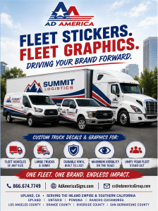 Fleet graphics get noticed more than most businesses realize. According to 3M’s research on fleet graphics, wrapped and decaled vehicles generate tens of thousands of impressions per day, and a 2019 Nielsen survey found that 64% of people had noticed a vehicle wrap or fleet graphic in the past month — outperforming traditional transit ads and poster billboards. That’s what makes this kind of marketing different from most advertising spend: a delivery van parked outside a job site, a semi pulling into a truck stop, or a box truck idling at a loading dock is doing marketing work whether the driver is thinking about it or not. Unlike a digital ad campaign that goes quiet the moment the budget runs out, Truck Decals and Fleet Graphics keep working every day the vehicle is on the road, for years at a time.
Truck Decals and Fleet Graphics for Semis and Diesel Trucks
Large trucks present a different design problem than a car or small van. A semi has a tractor and a trailer that may not even stay paired together, long flat surfaces that need graphics sized correctly to read at a distance, and mud flaps, fuel tanks, and stacks that break up where decals can go. Diesel trucks run harder miles, sit through more weather, and get washed less gently than a passenger vehicle, so this kind of graphic needs to hold up to road grime, UV exposure, and pressure washing without lifting, fading, or cracking. At Ad America, we design Fleet Graphics specifically around how a semi or diesel truck is actually built and driven — readable at highway speed, positioned around service points and access panels, and installed with materials rated for years of outdoor use. Whether it’s a single day cab, a sleeper-cab long-haul truck, a dump truck, or a full trailer, the graphics should be sized and placed for the vehicle in front of us, not a generic template.
What Federal Law Requires on Commercial Trucks
For fleet vehicles over a certain size, Truck Decals aren’t only a branding choice — some of them are required by law. Under 49 CFR 390.21, commercial motor vehicles must display the motor carrier’s legal or trade name and its USDOT number, in lettering that contrasts sharply with the vehicle’s background color and stays legible from 50 feet away during daylight. For trailers 80 inches or wider with a gross vehicle weight rating over 10,000 pounds, 49 CFR 393.11 requires retroreflective sheeting or reflectors — the familiar red-and-white striping along the sides and rear — so the vehicle stays visible to other drivers at night. Fleet managers and owner-operators are responsible for keeping that marking accurate, legible, and properly placed, which means this kind of vehicle graphic has to satisfy DOT compliance and brand consistency at the same time. Ad America builds both into the same design, so the required USDOT numbers, company name, and reflective markings work with your graphics instead of looking like an afterthought stuck on somewhere convenient.
Fleet Stickers Keep Every Truck On-Brand
A single truck with great graphics is a good start. A fleet where every vehicle matches is what actually builds recognition. Fleet Stickers — logos, phone numbers, service lists, DOT numbers, and smaller call-out graphics — need to be consistent across every truck in the fleet, whether that’s three box trucks or thirty semis. When one truck’s lettering is a different size than the one parked next to it, or the DOT number is a different font on every trailer, it reads as sloppy even if the work itself is fine. Ad America builds that consistency as a repeatable system: the same templates, materials, and placement rules applied to every vehicle that joins the fleet, so a truck added next year still matches the one that’s been on the road since 1986. You can browse our full product lineup to see the range of what’s possible on a single vehicle or across an entire fleet.
Materials Built for Life on the Road
Diesel trucks and semis don’t get the easy life a passenger car gets. They sit in direct sun for hours, get hit with road salt and debris, and go through commercial washes that are harder on vinyl than a garden hose. This kind of use needs premium cast vinyl, UV-rated laminate, and professional installation — the difference between a decal that still looks sharp in year three and one that’s peeling at the edges by month six. At Ad America, every Fleet Graphics project starts with matching the material to how the vehicle is actually going to be used: short-haul city trucks, long-haul semis, refrigerated trailers, and yard equipment all wear differently, and the right vinyl and adhesive system for one isn’t always right for another.
Every project at Ad America includes professional installation, not just printed vinyl handed over for someone else to apply. Proper installation matters as much as the material itself — a decal applied with air bubbles, misaligned seams, or the wrong surface prep will fail early no matter how good the vinyl is. Our installers work directly with fleet managers to schedule vehicles with minimal downtime, whether that means one truck at a time or a full fleet rotated through over a few weeks.
Truck Decals vs. Full Fleet Wraps — Choosing the Right Fit
Not every fleet vehicle needs a full wrap, and not every truck should stop at a logo and a phone number. Truck Decals make sense for fleets that need consistent branding without the cost of wrapping every panel — a company name, DOT markings, a service list, and a logo applied cleanly to doors and rear panels. Full Fleet Graphics wraps make more sense when a vehicle is the primary sales tool, like a company’s lead truck at trade shows or a highly visible delivery fleet in a competitive market. For semis specifically, many fleets land somewhere in between: full graphics on the tractor doors and rear of the trailer, with smaller decals covering the required DOT information and call-outs everywhere else. Ad America walks fleet managers through that decision based on budget, how the vehicle is used, and how much of the surface actually needs to carry a message — there’s no reason to pay for a full wrap on a yard truck that never leaves the lot, and no reason to under-brand a truck that’s on the highway every day.
The Return on Investment for Fleet Graphics
Compared to a monthly ad budget, Fleet Graphics are close to a one-time cost that keeps paying off for years. A semi running regional routes can rack up tens of thousands of highway miles a year, and every one of those miles puts your brand in front of new drivers who’ve never seen the company name before. Add in loading docks, truck stops, and job sites, and a well-marked fleet is generating impressions a print or digital campaign simply can’t match at the same cost. For fleet managers weighing where to spend a limited marketing budget, this is one of the few line items that keeps working long after the invoice is paid.
Serving Southern California Since 1986
Ad America has produced vehicle graphics for fleet vehicles, diesel trucks, and semis across Southern California since 1986. We proudly serve businesses throughout:
- Upland
- Ontario
- Rancho Cucamonga
- Pomona
- Claremont
- Fontana
- Riverside
- San Bernardino
- Los Angeles County
- Orange County
- Riverside County
- San Bernardino County
- Throughout Southern California
Four decades of doing this means we understand what a fleet manager actually needs — DOT-compliant marking, durable materials, and a design system that scales from one truck to a hundred.
Ready to Get Your Fleet on the Road?
If you manage a fleet of delivery vans, diesel trucks, or semis and need Truck Decals, Fleet Stickers, or full Fleet Graphics that are built to last, Ad America is ready to help. Call 866.674.7749, email cs@adamericaGroup.com, or visit AdAmericaSigns.com to start a design consultation. Ready to see what’s possible on your trucks? Shop our full product line to get started.
When Graphics Matter™, trust the company that’s been serving fleets across Southern California since 1986.
Ad America — Vehicle Graphics for Fleets & Semis Since 1986
AdAmericaSigns.com | cs@adamericaGroup.com | 866.674.7749
by Ad America | Aug 7, 2026 | Food Trucks & Concessions
Why Every Food Truck, Coffee Trailer, and Mobile Kitchen Needs Food Truck Wraps That Work as Hard as the Food Inside
Your food truck should sell even when you’re driving. Great food gets customers to come back. Great food truck wraps get them to stop the first time. Since 1986, Ad America has been creating food truck wraps and graphics for the food industry that help food trucks attract attention and build memorable brands.
The best food trucks have something in common long before anyone takes a bite: they get noticed. Whether you’re parked at a downtown lunch spot, set up at a county fair, working a brewery patio, or driving to your next event, your truck is in front of hundreds or thousands of potential customers every single day. The question worth asking is simple — is your truck advertising your business, or just transporting it? At Ad America, we’ve believed for decades that a food truck should do more than carry your equipment from stop to stop. Professionally designed food truck wraps turn it into your hardest-working advertising investment. Since 1986, we’ve designed and produced food truck wraps and graphics for the food industry — food truck owners, coffee trailer builders, concession operators, and the manufacturers who build the vehicles this industry runs on. Based in the Inland Empire and serving businesses across Southern California, we’ve watched great graphics turn an ordinary truck into a customer-generating machine, again and again. Because when Graphics Matter™, every mile becomes marketing.
A Truck That Never Clocks Out
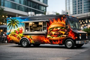 Unlike a billboard bolted to one intersection or a radio spot that airs and disappears, your food truck advertises wherever it goes — rolling down the freeway, idling outside a brewery, parked at a festival, working a lunch rush outside an office park, even on the drive home after close. Most business owners spend thousands of dollars a month on digital ads, social posts, and print campaigns that stop producing the moment the budget runs out. A professionally designed food truck wrap keeps advertising every day for years, at no additional monthly cost.
Think about a typical week: a run to the commissary kitchen, a drive to a festival two counties over, a Friday night outside a brewery, a Tuesday lunch rotation through an office complex, a Saturday at a community event. Every one of those stops puts your brand in front of people who have never heard of you. The better the graphics, the more of them remember your name the next time they’re hungry.
First Impressions Happen Before the Menu
Plenty of food truck owners spend years perfecting a recipe, sourcing better ingredients, and training staff to deliver great service — and then overlook the one thing every customer sees before any of that matters: the truck itself. People judge quality by appearance, often in the first few seconds, long before they smell the food or read a menu. A clean, professionally designed food truck wrap signals that the operation behind it is careful and consistent. Faded colors, cluttered layouts, or an amateur logo send the opposite message, whether that’s fair or not. Customers are making a buy-or-walk-away decision before they’ve spoken to your staff, and your graphics are doing that talking for you.
Why Food-Industry Experience Actually Matters
Wrapping a plumbing van and designing food truck wraps for a gourmet taco truck are not the same job. Since 1986, Ad America has worked specifically with food businesses, which means we understand things a generalist wrap shop doesn’t: how to use food photography that makes people hungry instead of confused, how to keep a menu board readable at ten feet and thirty miles an hour, how health department signage requirements fit into a design instead of fighting it, and how a truck’s actual layout — service windows, prep areas, signage placement — should shape the graphics rather than the other way around.
That experience shows up in the range of businesses we’ve helped get noticed, including:
- Gourmet burgers, BBQ, and pizza
- Ice cream, shaved ice, and specialty desserts
- Coffee and boba tea
- Mexican and Mediterranean cuisine
- Fair food, funnel cakes, and loaded fries
- Mobile catering and gourmet sandwiches
- Acai bowls and fresh juice
- Hot dogs, tacos, and lemonade
Every one of those categories draws a different customer with different expectations, and a design that works for a burger truck won’t necessarily work for a boba stand. That’s the kind of judgment that only comes from doing this for decades.
That local knowledge extends to compliance, too. In Riverside County, that means designing around Riverside County’s mobile food facility signage requirements; in San Bernardino County, it means making sure your permit stays clearly visible per County Environmental Health Services guidelines. Good graphics work with those rules, not around them.
Manufacturers Need a Food Truck Wraps Partner, Not Just a Vinyl Printer, see https://adamericasigns.com/our-gallery/food-trucks-graphic-concession-wrap/
The food truck industry doesn’t start with the owner — it starts with the manufacturer. Every week, builders across the country deliver custom trucks and trailers that are mechanically ready but visually blank, and many manufacturers still hand that last step off to a separate wrap shop after the build is complete, adding time and inconsistency to a process that’s supposed to end with a finished, sellable product.
Ad America has become a trusted food truck wraps partner for manufacturers because we understand production schedules, vehicle construction, and installation logistics well enough to work inside your timeline instead of around it. Whether you’re building food trucks, coffee trailers, mobile coffee carts, concession trailers, catering trucks, mobile kitchens, specialty beverage trailers, or ice cream trucks, our team can coordinate graphics so your customers take delivery of a vehicle that’s ready to generate business on day one — not one that still needs a separate stop at the wrap shop.
Manufacturers can reach out through AdAmericaSigns.com to talk through production schedules before the first truck rolls off the line.
Coffee Trailers and Mobile Beverage Builds Deserve the Same Care
Coffee is one of the fastest-growing segments in mobile food, and coffee customers aren’t just buying a drink — they’re buying an experience. A coffee trailer’s graphics need to communicate premium quality, craftsmanship, warmth, and consistency before a customer ever reads the menu board, whether you’re serving espresso, cold brew, specialty drinks, smoothies, or pastries. We’ve worked with coffee trailer owners and builders to develop branding that makes a strong first impression while staying clean, modern, and easy to recognize from across a parking lot — which matters just as much for a manufacturer building beverage trailers at scale as it does for a single operator launching a first cart.
More Than a Wrap — Food Truck Wraps as a Complete Branding System
A lot of people think wrapping a food truck just means printing vinyl and sticking it on. In practice, the work that actually moves the needle starts earlier, with a handful of questions: Who is your customer? What kind of food or drink are you selling? What should people feel when they see your truck? What makes you different from the truck parked next to you? The answers shape every design decision that follows.
At Ad America, that process combines graphic design and brand identity development, vehicle wrap design, food photography integration, logo refinement, large-format printing, professional installation, and durable, premium materials built to hold up outdoors for years. The result isn’t just a wrap — it’s a branding system your truck carries with it everywhere it goes.
You can browse examples of that work on our website before you ever pick up the phone.
Consistency Is What Makes a Brand Stick
The most successful food trucks look like the same business everywhere a customer encounters them — the truck, the menu board, the website, social media, staff uniforms, tents, flags, and packaging. When everything matches, customers recognize you faster, and recognition builds trust, and trust is what turns a first-time customer into a regular one. That’s why Ad America’s work with food businesses regularly extends past the truck itself, into the full set of materials that carry a brand from the serving window to the customer’s phone.
As trade publications like Mobile Cuisine regularly point out, that kind of consistency is what separates trucks people remember from trucks people forget.
The Return on Investment Is Hard to Match
Unlike a monthly ad spend that has to be renewed to keep working, professionally designed food truck wraps keep producing impressions for as long as it’s on the road — thousands of them a week, at every stoplight, on every freeway on-ramp, in every parking lot, at every event, and in every photo a customer posts to social media. Few marketing investments keep paying off years after the initial cost, but a well-designed wrap does exactly that.
That payoff matters more every year: the U.S. food truck industry is projected to grow at a 6.3% CAGR through 2030, which means more trucks on the road competing for the same customers — and more reason to make sure yours is the one people remember.
Serving Southern California Since 1986
Ad America designs food truck wraps for businesses based in the Inland Empire and across Upland, Ontario, Rancho Cucamonga, Pomona, Claremont, Fontana, Riverside, and San Bernardino, along with clients throughout Los Angeles, Orange, Riverside, and San Bernardino counties and the rest of Southern California. Four decades in, our longevity isn’t an accident — it’s built on relationships, craftsmanship, and an understanding of the food industry that most graphics companies simply don’t have.
Ready to Build a Truck That Gets Noticed?
If you’re a food truck owner, a food truck or trailer manufacturer, a mobile coffee business, or a builder of catering vehicles, concession trailers, or mobile kitchens, Ad America is ready to help with food truck wraps and graphics that do their share of the selling. Call 866.674.7749, email cs@adamericaGroup.com, or visit AdAmericaSigns.com to start a design consultation. For nearly forty years, we’ve specialized in graphics that help food businesses grow — because your truck should be selling even when you’re driving.
When Graphics Matter™, trust the company that’s been serving the food industry since 1986.
Ad America — Creating Graphics for the Food Industry Since 1986
AdAmericaSigns.com | cs@adamericaGroup.com | 866.674.7749
by Ad America | Jul 31, 2026 | SEO Articles
Every Truck That Leaves Your Yard Is Either Working for Your Brand or Wasting the Trip
If you run a fleet in the Inland Empire, your vehicles are already doing the driving — to job sites in Ontario, warehouses in Fontana, neighborhoods in Rancho Cucamonga, and everywhere in between. A wrapped fleet turns that unavoidable windshield time into the cheapest, most repetitive advertising your business will ever buy. An unwrapped fleet just burns gas.
Ad America Signs has designed and installed fleet graphics for Southern California businesses out of our Upland shop since 1986. We’ve watched the Inland Empire grow into one of the country’s biggest logistics and distribution corridors, which means we’ve also watched a lot of local companies — HVAC and plumbing contractors, delivery and courier services, property maintenance crews, restoration companies — figure out that a matching fleet is one of the few marketing investments that keeps paying off years after it’s installed.
Below are 7 proven, concrete reasons fleet wraps earn their cost — plus what makes a fleet program hold up across ten or a hundred vehicles, and how to plan an installation without shutting down your operations. For a full walkthrough of the wrap design-to-install process and how to care for a wrap once it’s on the vehicle, see our companion guide, Full Vehicle Wraps: A Complete Guide — this article focuses on what’s different when you’re branding a fleet instead of a single vehicle.
What Are Fleet Wraps?
Fleet wraps are custom vinyl graphics applied consistently across a group of company vehicles. Coverage can range from full-body wraps to partial graphics to simple cut-vinyl lettering, and a fleet program often includes:
- Full or partial vehicle wraps
- Cut-vinyl lettering and printed decals
- Department, division, or unit numbering
- DOT numbers and required safety markings
- Website, phone number, and QR codes
The vehicles in a fleet are rarely identical. A mixed fleet might include sedans, pickups, cargo vans, box trucks, and trailers from different model years. The job of a fleet wrap system isn’t to force one flat design onto every body style — it’s to adapt a consistent visual identity so a Sprinter van, a Ford F-250, and a box truck all read as the same company at a glance, even though the graphic layout on each one is different.
That adaptation is where a lot of DIY or bargain fleet jobs fall apart: stretch one template across a different vehicle without adjusting for its proportions, and you get a stretched logo, copy that lands on a door handle, or a phone number that disappears into a body seam.
7 Proven Benefits of Wrapping Your Fleet
1. Repetition builds recognition, and a fleet multiplies it
One wrapped van is a nice-looking vehicle. Ten wrapped vans with the same colors, logo, and message showing up across the same service area is a brand people start to recognize before they’ve ever called you. A homeowner sees your van at a neighbor’s house on Monday, passes another one on the 210 on Wednesday, and spots a third parked outside a job site on Friday — each sighting reinforces the last one without you spending anything extra.
2. It creates a professional first impression at every job site
For service businesses especially, the vehicle showing up at a customer’s home or business is part of the sales pitch. A fleet where every truck looks the same, clean, and clearly branded signals an operation that has its act together — which matters when you’re competing against a truck with a magnetic sign held on with two suction cups.
3. It keeps you visible in your actual service territory
Fleet wraps do the most work for businesses with a defined service area — contractors, delivery and logistics operators, restoration companies, property managers. Your trucks are already driving through the neighborhoods and business parks where your next customer lives. The wrap just makes sure they notice.
4. It keeps a growing fleet from drifting off-brand
This is the problem we see most often with fleets that add trucks over a few years without a documented system: the logo on the newest van is bigger than the one from three years ago, the phone number moved, and two trucks are using an old tagline nobody uses anymore. A fleet wrap program with an approved design file and production spec fixes that — every new vehicle gets built to the same standard instead of “close enough.”
5. It turns unavoidable drive time into free advertising
Your drivers are already on the road running routes, making deliveries, and heading to job sites. That travel happens whether the vehicle is branded or not — a wrap just makes sure the miles you’re already driving are doing marketing work at the same time, at no extra cost per mile.
6. It keeps working when your ad budget doesn’t
Digital and paid ads stop the moment you pause the campaign. A fleet wrap keeps advertising every time the vehicle is on the road or parked at a job site — nights, weekends, and slow months included — for as long as it’s on the vehicle.
7. It scales affordably as your fleet grows
You don’t need a large fleet to start. Two matching vehicles already read as a brand, and the same design system scales as you add trucks — often at a lower per-vehicle cost once you’re wrapping several vehicles at once. (See our Vehicle Wrap Cost Guide for how fleet volume pricing works.)
Full Wraps, Partial Wraps, or Fleet Lettering — What Fits a Multi-Vehicle Budget?
The right coverage for a fleet is less about what looks best on one truck and more about what you can afford and maintain across every truck.
Full wraps create the biggest visual impact and the most control over the design, but they’re also the highest cost per vehicle — usually reserved for customer-facing vehicles where the brand transformation matters most.
Partial wraps use the vehicle’s factory paint as part of the design, which lowers material cost while still reading as intentional branding. This is a common middle-ground choice for fleets trying to brand a lot of trucks without a full-wrap budget on every one.
Lettering and decal packages — logo, phone number, website, DOT number, unit number — are the most efficient way to brand a large fleet on a tighter budget, and they hold up well for vehicles that rotate out every few years.
Plenty of fleets mix all three: full wraps on the trucks that show up at customer sites, partial wraps or lettering on support and yard vehicles. The rule that matters is consistency in the elements that carry the brand — logo, color, typography, and message — even when the coverage level changes truck to truck. For a full breakdown of how coverage decisions affect price, see our Vehicle Wrap Cost Guide.
Scheduling a Fleet Installation Without Parking Your Whole Business
This is the part that’s unique to fleets and worth planning for before you call anyone: vehicles that are out for wrap installation aren’t generating revenue, and most businesses can’t afford to take an entire fleet off the road at once.
Most fleet programs get phased in groups — a third of the fleet this week, the next third once the first batch is back in service, and so on — so routes and job commitments keep running. New vehicles get wrapped to the same spec as they’re delivered, rather than waiting for a full fleet “event.”
Before scheduling, it’s worth having someone inspect each vehicle for paint failure, rust, dents, or old adhesive residue. Vinyl follows whatever is underneath it — it won’t fix a dent or hide failing clear coat — so catching those issues before the truck is on the schedule avoids surprises mid-install. Vehicles should also arrive clean; road film, wax, and grease all affect how well the vinyl adheres.
For the general step-by-step of how a wrap goes from design to installed vehicle — and how to care for it afterward — see Full Vehicle Wraps: A Complete Guide.
Which Businesses Get the Most Out of Fleet Wraps
Almost any company with more than one branded vehicle benefits, but it shows up especially clearly for:
- Plumbing, HVAC, electrical, and restoration contractors
- Landscaping and property maintenance companies
- Delivery, courier, and logistics operators — a big category in the Inland Empire specifically
- Cleaning and pest control companies
- Real estate and property management teams
- Schools, public agencies, and community organizations
You don’t need a large fleet to start. Two matching vehicles already read as a brand; the same design system just scales as you add trucks.
Beyond Vehicle Graphics
Fleet wraps are one piece of a company’s visual presence. If you’re also looking at channel letters, banners, wall murals, or other signage, this signs portfolio is a good place to browse examples of related sign work.
Fleet Wraps: Frequently Asked Questions
How many vehicles do I need before a “fleet” wrap program makes sense? There’s no minimum — two vehicles with a shared design already build recognition. The main benefit of treating it as a documented fleet program (rather than one-off wraps) shows up once you’re adding a third or fourth vehicle and want it to match without redesigning from scratch.
Can you wrap a mixed fleet of different makes and models? Yes. The design is built once and adapted to each vehicle’s body style so the logo, colors, and message stay consistent even though the layout changes truck to truck.
How long does a fleet installation take? It depends on fleet size and how many vehicles can be down at once. Most fleets get phased in groups over several weeks so the business keeps operating; we’ll build a schedule around your routes and job commitments during the consultation.
Do you handle DOT numbers and required safety markings? Yes — those can be built into the same design so the required information is placed correctly and stays legible.
What if I only have a couple of vehicles now but plan to add more? That’s the norm, not the exception. We keep the approved design files on hand so new vehicles can be matched to the existing fleet without starting the design process over.
Ready to Get Your Fleet on Brand?
Every unwrapped truck in your fleet is a missed impression. Ad America Signs has been designing, producing, and installing vehicle graphics for Inland Empire businesses since 1986 — from a two-van operation to fleets that add trucks every year.
Call us at 844-674-7749 or visit AdAmericaSigns.com to talk through your fleet, your timeline, and what a phased installation would look like for your business.
by Ad America | Jun 26, 2026 | SEO Articles
A food truck has about three seconds to make an impression. People see it while driving by, walking past, or scanning a crowded event for lunch. That is why experienced food truck graphics matter. The right design does more than make a truck look good – it helps people notice you fast, understand what you sell, remember your name, and feel confident enough to order.
For food truck owners, graphics are not a side detail. They are part signage, part advertising, and part brand identity. A truck without a clear visual strategy can look generic, hard to read, or inconsistent with the quality of the food being served. A truck with strong graphics works harder every hour it is on the road or parked at an event.
What experienced food truck graphics really do
The value starts with visibility, but it does not stop there. A food truck is a moving storefront, and every panel has a job to do. Color gets attention. Typography communicates quickly. Images create appetite. Layout directs the eye. Together, these elements shape how people judge your business before they ever reach the window.
Experienced food truck graphics help solve a practical problem: how to communicate a lot in a limited space. You need people to recognize your brand, understand your menu category, and spot ordering information without standing directly in front of the truck. That takes planning. It also takes restraint. Trying to fit everything on every surface usually weakens the impact.
A professional graphics strategy also supports consistency. If your truck wrap, menu boards, social posts, printed handouts, and event signage all feel disconnected, the brand loses strength. When they work together, your business looks established and trustworthy, which can matter just as much as taste when customers are choosing between several vendors.
Why food truck design is different from other vehicle wraps
Not every vehicle graphic company understands the demands of food service branding. A standard fleet wrap for a contractor or delivery van has different goals than a food truck. Contractors may need a logo, phone number, and list of services. Food trucks need to create hunger, excitement, and fast recognition in busy, often competitive settings.
That means design decisions need to account for both branding and buying behavior. A beautiful wrap can still underperform if nobody can tell whether you sell tacos, coffee, barbecue, or desserts. On the other hand, a truck that is overly literal can end up looking cluttered or cheap. The best results usually come from balancing appetite appeal with clean communication.
There is also the issue of viewing distance. Food truck graphics need to work from across a parking lot, from the curb, and from the line itself. Small type, low-contrast colors, and cramped layouts often fail in real conditions, even if they looked fine on a computer screen. Experience helps because it brings an understanding of how design performs in the field, not just in a mockup.
The core elements of experienced food truck graphics
A successful truck wrap starts with brand clarity. Your name should be easy to find and easy to read. If your business name does not clearly describe your food, the design should quickly fill that gap with supporting text or imagery. Customers should not have to guess what you serve.
Color selection is another critical factor. Bright color can help a truck stand out, but color also needs to align with your concept. A dessert truck may benefit from playful, energetic tones. A premium coffee or gourmet concept may need a more refined palette. The point is not to use the loudest color possible. The point is to use color strategically so the truck attracts attention and feels on-brand.
Typography carries more weight than many owners realize. Script fonts can look stylish but become unreadable from a distance. Overly decorative lettering may fit the theme but hurt legibility. Strong food truck graphics usually rely on fonts that are distinctive enough to feel branded and simple enough to read in motion.
Photography and illustration can also make or break the design. Large food images can drive appetite, but low-quality photos instantly cheapen the truck. Custom illustration can create personality, especially for niche concepts, but it has to support the message rather than distract from it. The right choice depends on the brand, budget, and audience.
Experienced food truck graphics and the customer experience
Graphics influence more than first impressions. They also affect how smoothly customers interact with your business. A truck that clearly shows its name, ordering side, website, social handle, and menu style creates less friction. People know where to go, what to expect, and how to find you again.
That matters at festivals, school events, brewery nights, and private bookings where foot traffic moves quickly and decisions happen fast. If your truck looks polished and easy to understand, you remove barriers to purchase. If it looks confusing or inconsistent, customers may move to the next option.
This is where full-service planning becomes valuable. Graphics should work with menu boards, window decals, directional signage, and promotional materials. When those pieces are developed together, the entire setup feels more professional. For owners juggling operations, staffing, inventory, and event scheduling, that kind of coordination saves time and improves results.
Common mistakes that hurt food truck performance
One of the biggest mistakes is treating the truck like a canvas instead of a sales tool. Creative design matters, but it has to support business goals. If the wrap wins compliments but does not clearly communicate the brand and menu category, it is not doing its job.
Another common issue is overcrowding. Owners often want to include every menu item, every social platform, every sponsor, and every message. In practice, too much information makes the truck harder to read. Prioritization matters. Usually, the strongest truck graphics focus on a few essential messages and present them with confidence.
Cheap production is another risk. A strong design printed poorly or installed without care can bubble, fade, peel, or misalign. For a food truck, where appearance directly affects buying decisions, production quality is part of the brand. Materials, color accuracy, installation standards, and durability all matter, especially in Southern California sun and regular road use.
How to choose the right partner for food truck graphics
The best partner is not just a designer and not just an installer. You want a team that understands branding, large-format production, and how customers respond to visual environments. That combination leads to better recommendations from the start.
Ask how they approach layout, readability, and traffic flow around the truck. Ask whether they can support related pieces like menu boards, event signage, print materials, and promotional products. Ask how they handle concept development, proofs, production, and installation. Food truck owners are often busy building their business. A partner who can manage the full process is easier to work with and more likely to deliver a cohesive result.
Local experience also helps. A company that understands community events, regional competition, and the visual landscape of the Inland Empire can make more practical recommendations. That is one reason businesses continue to work with established providers like Ad America, where branding, design, production, and installation can be coordinated under one roof.
When to update experienced food truck graphics
A new truck obviously needs a strong launch, but existing trucks also benefit from reevaluation. If your branding has changed, your menu has shifted, or your truck no longer reflects the quality of your food, the graphics may be holding you back. Even a solid concept can look dated after years of wear.
The timing depends on condition and business goals. Some owners need a full redesign to reposition the brand. Others only need refinements such as cleaner messaging, updated imagery, or better integration with current marketing materials. The right move depends on whether the issue is aesthetics, performance, or both.
Good graphics should earn their place. They should help increase recognition, support repeat business, and make the truck easier to market at every stop. If the current design is not doing that, it is worth fixing.
Food truck owners put serious work into recipes, service, scheduling, and logistics. The visual side should work just as hard. When your truck looks clear, credible, and memorable, it does more than turn heads – it helps turn foot traffic into paying customers.
by Ad America | Jun 23, 2026 | SEO Articles
A fleet vehicle only gets one chance to make a first impression in traffic. If your trucks, vans, or service cars look inconsistent, poorly installed, or already peeling at the edges, that impression works against you. When businesses search for fleet graphics installation near me, they are usually not looking for decoration. They are looking for visibility, credibility, and a local partner who can get the job done right without disrupting operations.
For companies across Upland, the Inland Empire, and surrounding Southern California communities, fleet graphics are not just a marketing add-on. They are moving brand assets. Every route, service call, delivery stop, school pickup, or event setup becomes an opportunity to reinforce your name, your professionalism, and your reach. The quality of the installation matters just as much as the design, because even the strongest concept can fail in the field if the material is applied poorly.
Why local fleet graphics installation matters
Searching for a nearby installer is about more than convenience. Local access affects speed, communication, quality control, and long-term support. If you manage several vehicles, timing becomes a real business issue. You may need staged installation, after-hours scheduling, or a plan that keeps part of your fleet on the road while the rest is being wrapped or lettered.
A local team can inspect vehicles in person, flag body issues before production, and recommend the right graphics approach based on use. A plumbing company that runs heavy-duty work vans has different needs than a private school fleet, a catering company, or a municipal services department. Climate matters too. Southern California sun, heat, and daily wear can be hard on lower-grade vinyl or rushed installation work.
There is also the practical side of accountability. If a panel lifts, a logo placement needs adjustment, or a new vehicle has to match an existing fleet, having a local provider makes the process easier. You are not chasing a vendor in another region or trying to solve a visual branding problem through email alone.
What good fleet graphics installation near me should include
Not every shop that installs vinyl is equipped to manage fleet work well. A single promotional wrap on one vehicle is different from building a repeatable system for multiple vehicles across a business or organization. Fleet graphics require consistency, planning, and production discipline.
A dependable provider should start with the vehicle type, the use case, and your brand standards. The design needs to work across different body styles while still looking unified. A pickup, cargo van, box truck, and trailer do not offer the same dimensions, sightlines, or surface challenges. What matters is building a system that holds together visually, not forcing one layout onto every shape.
Installation quality also depends on preparation. Vehicles should be cleaned properly, surfaces inspected, and graphics fitted with attention to curves, seams, rivets, and recessed areas. If the installer rushes this stage, problems show up later as bubbles, edge failure, distortion, or premature wear. That is not just a cosmetic issue. It affects how your company is perceived on the road.
Good fleet graphics work also includes practical guidance. Some businesses need full wraps for maximum impact. Others are better served by partial wraps, spot graphics, decals, or door lettering because of budget, replacement cycles, or maintenance conditions. The right answer depends on the fleet, not on what is easiest to sell.
Design and installation should work together
One of the most common mistakes in fleet branding is separating design from production reality. A layout can look excellent on a screen and still fail on an actual vehicle if critical details land in awkward body seams or important text becomes unreadable at driving distance.
That is why a full-service approach has a real advantage. When the design team and production team work together, decisions are made with the final installation in mind. Readability, panel breaks, door handles, visibility from multiple angles, and color consistency can all be addressed before the vinyl is printed.
For growing companies, this matters even more. Fleet graphics are often part of a larger branding system that includes signage, printed materials, apparel, web presence, and promotional items. If your vehicles look polished but disconnected from everything else, you lose some of the value. Consistency builds recognition. Recognition builds trust.
Questions worth asking before you hire anyone
If you are comparing providers for fleet graphics installation near me, the conversation should go beyond price. Cost matters, but so do durability, scheduling, process, and support.
Ask how they handle multi-vehicle consistency. Ask whether they evaluate vehicles before production. Ask what materials they recommend for your vehicle type and expected lifespan. Ask how long installation will take and whether they can phase the work to reduce downtime. If you have a fleet that is on the road daily, turnaround planning is not a small detail.
It is also smart to ask who is managing the project. Fleet jobs move more smoothly when one partner can coordinate design, production, and installation under one roof. That reduces handoff errors and gives you a clearer point of contact from start to finish.
A provider with deep local experience can usually spot issues early. They know which vehicle types are common in the area, what branding styles perform well in local markets, and how to build graphics that hold up under regional driving and weather conditions.
What affects cost and timeline
Businesses often want a fast quote, but fleet graphics pricing depends on several variables. Vehicle size is one of them, but not the only one. The scope of coverage, the complexity of the layout, the condition of the vehicle surface, the number of vehicles, and the installation schedule all affect the final cost.
A simple cut-vinyl lettering package for a small service fleet will cost less than a full-color wrap program with custom design and installation across mixed vehicle types. That does not mean cheaper is better. It means the right solution should match your goals. If your vehicles spend all day in residential neighborhoods, stronger visual impact may justify the investment. If your fleet turns over frequently, a more flexible graphics strategy may make more sense.
Timeline depends on design approval, production readiness, and scheduling. If you need multiple vehicles wrapped quickly before a launch, trade show, school season, or community campaign, local coordination becomes especially valuable. Fast work is helpful, but rushed work can create problems later. The better goal is efficient work with proper planning.
The long-term value of professionally installed fleet graphics
Fleet graphics pay off in ways that are both visible and practical. They create repeated exposure in the exact markets where you do business. They make your team easier to identify at job sites and customer locations. They help smaller companies look established, and they help established companies stay top of mind.
Professional installation protects that investment. Clean alignment, strong adhesion, and careful finishing all contribute to a better-looking vehicle and a longer service life. It also reduces the chance that you will need early repairs or rework, which saves time and money over the life of the graphics.
For many organizations, fleet graphics are also part of operational discipline. Branded vehicles can support driver accountability, reinforce company pride, and create a more unified presentation across crews and locations. That is especially useful for service businesses, schools, contractors, nonprofits, and community-facing organizations that depend on trust.
Choosing a partner, not just an installer
The best results usually come from working with a company that sees fleet graphics as part of your larger brand presence, not as an isolated vinyl job. That means thinking through design, vehicle mix, production quality, installation timing, and future additions before problems show up.
For Southern California businesses that want local knowledge, hands-on service, and one-source support, that broader approach matters. A company like Ad America brings design, print, signage, and vehicle graphics together so businesses do not have to coordinate multiple vendors just to keep branding consistent.
If you are searching for fleet graphics installation near me, look for a provider that understands your vehicles are working assets. The right graphics should help them work harder for your brand every mile they travel.
